Managing Templates
This section explains how to create a form, configure the form properties and filters for field values, apply rules and perform other activities against the template.
Building the Form
This section explains how to build a form, upon associating various types of fields (for example, single line, picklist, boolean and so on) with it and customizing them (for example, making mandatory, non-editable and so on) as required.
To build a new form,
Select a module and then select the required template.

The BUILDER screen is shown in the screenshot below.
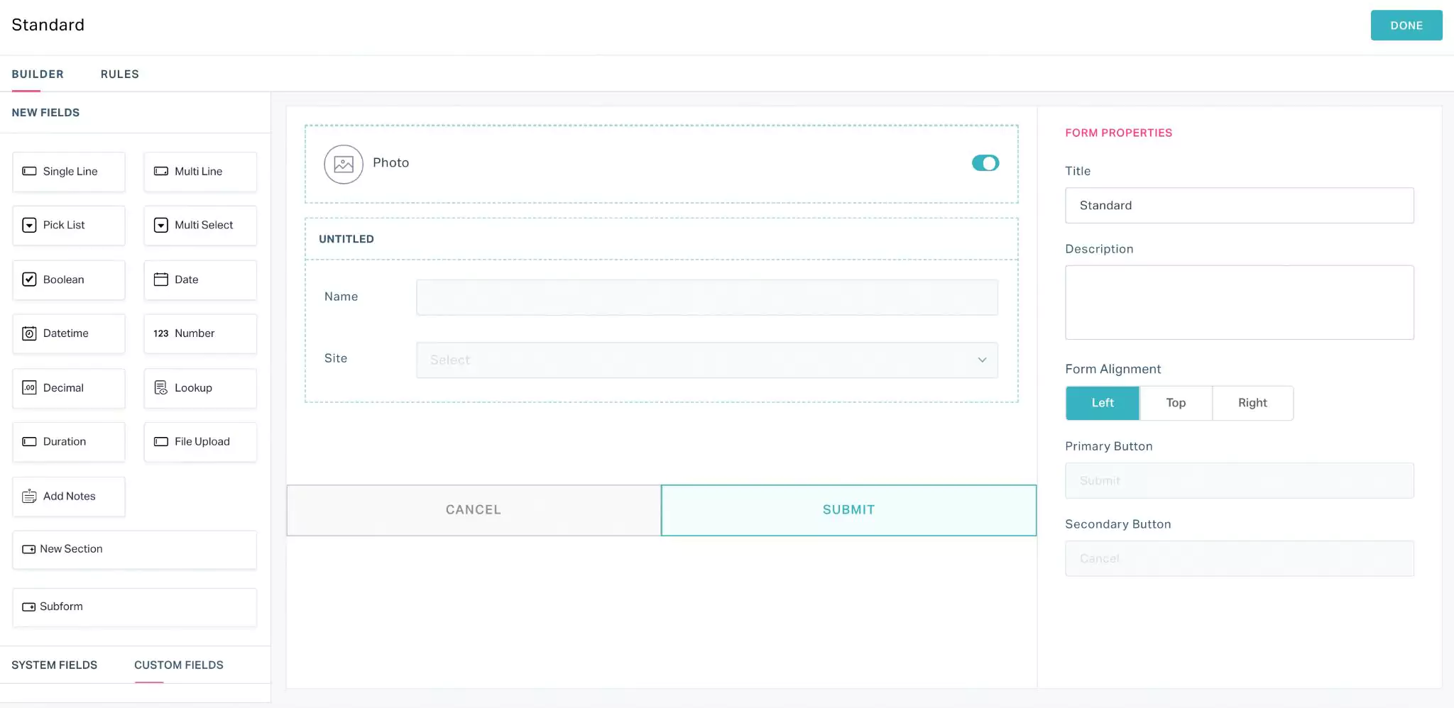 Note: You will also be directed to the builder screen while creating a new template (using the ADD TEMPLATE button) in association with any module.
Drag and drop any of the following field types in to the template or form:
Field TypeDescription Single Line Inserts a single line field. Note: You can enter a maximum of 250 characters. This field type can be used to capture name, email Id and so on.
Multi Line Inserts a large character field. Note: You can enter a maximum of 32000 characters. This field type can be used to capture detailed descriptions.
Pick List Inserts a dropdown field. Note: You can configure the options in the dropdown of your choice. This field is single select.
Multi Select Inserts a dropdown field similar to the picklist. Note: You can configure the options in the dropdown of your choice. This field is multi select.
Boolean Inserts a boolean field, that is, a yes or no field. Note: You can opt to configure the display type of the field as a checkbox or radio button.

Date Inserts a date field. Note: You can set the default date to be displayed in this field. Alternatively, you can choose to display the current date by default.
Datetime Inserts a date and time field. Note: You can set the default date and time to be displayed in this field. Alternatively, you can choose to display the current date and time by default.
Number Inserts a numerical input field. Note: You can select the metric to be captured and set the unit of measurement. For example, If you choose to capture the temperature in celsius, the number field is displayed as shown below. This field does not accept decimal values.
Decimal Inserts a numerical input field.
Note: You can select the metric to be captured and set the unit of measurement. For example, If you choose to capture the temperature in celsius, the number field is displayed as shown below.This field accepts decimal values.Lookup Inserts the selected module (that is, the value set in the Type field) as a drop down field wherein, the records in the respective module (that is, data in the module) are looked up as the dropdown values. Here, a drop down field is created in the form for work orders and the data in the respective module are looked up as drop down values as shown below.

Duration Inserts a field to capture the duration of any task. Note: You can set the default duration (combination of days and hours or hours and minutes) to be displayed in this field. This field type can be used to capture estimated and due time for a task.
File Upload Inserts a field to upload images or documents. Note: You can either drag and drop or click and upload the attachment. This field type can be used to acquire gate passes, work permits and so on.
Add Notes Inserts tips or notes for the user in the template New Section Inserts a new section in the template, into which you can add the required fields. Note: You can add a new section in a form to capture a different set of information.
Signature Inserts a field to capture digital signature Subform Inserts the default form from the selected module. Note: You can use the
 icon to add more fields to the form. The fields displayed for selection are looked up from the module to which the subform originally belongs.
Any field inserted into a form as explained above is added as a custom field. You can also drag and drop the existing/predefined fields from the SYSTEM FIELDS and CUSTOM FIELDS sections in the left panel. Read the Managing Fields section for more information.
Tip: It is recommended to reuse the existing system fields as much as possible, avoiding the recreation of a system field as a custom field. For example, if you need a Site field, check if the field already exists as a system field. If not, you can create it as a custom field.Also, while adding portfolio related fields, you can consider adding them under the Space module rather than the Site or Building modules.
You can use the
 and
and  icons corresponding to a field to resize and remove it, respectively.Note: There are certain fields in the form that cannot be removed (that is, the icon will not be available) For example, you cannot remove Name and Site fields in a form. But these fields can be hidden, if required (read the Field Properties section for more information).
 All the updates to the form are saved automatically. Read the Configuring Properties section for details on how to customize the components (for example, field and section) of a template.
Configuring Properties
This section explains the possible settings of a form, and configuration of sections and individual fields in a form.
Form Properties
To configure the properties of a form, select the form name at the top right of the template. The FORM PROPERTIES section appears as shown in the screenshot below.
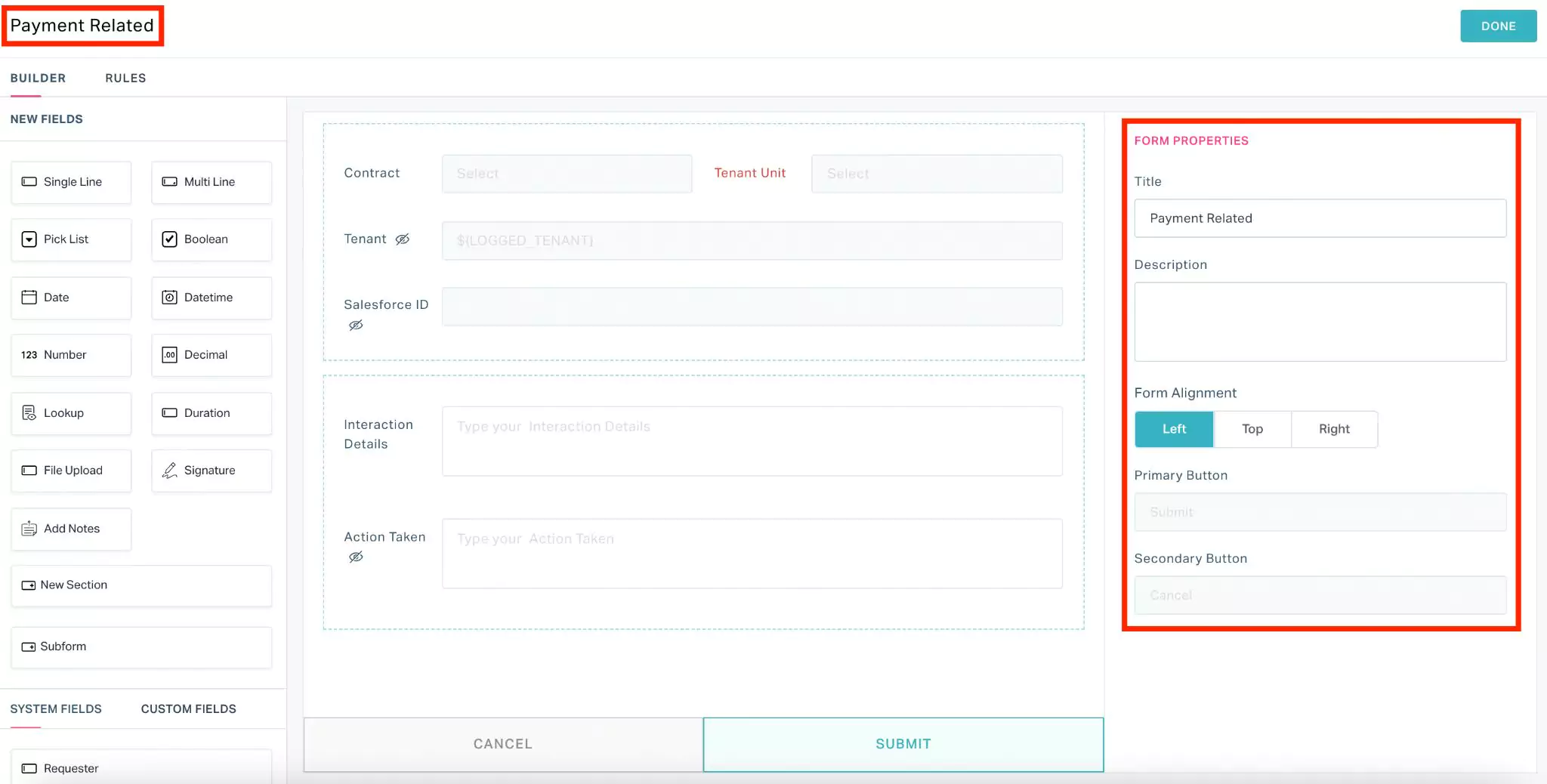
You can update the following fields as a part of form property configuration:
Title - To modify the form name
Description - To add a short description about the form to be displayed for the user
Form Alignment - To position the field names against their respective text boxes (that is, left, top or right)
Example: If Form Alignment is set to Top, the form fields appear as shown below.
The Primary Button and Secondary Button fields are set to Submit and Cancel, respectively and cannot be modified.
Section Properties
To configure the properties of a section in a form, select the section. The SECTION PROPERTIES are displayed as shown in the screenshot below.
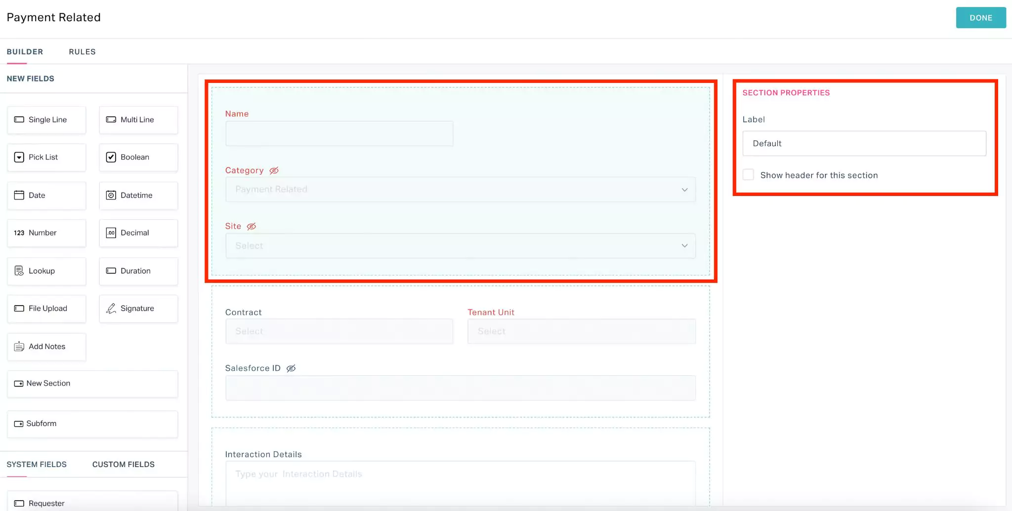
You can update the following fields as a part of section property configuration:
- Label - To modify the section title
- Show header for this section - To enable or disable section title
Field Properties
To configure the properties of a field in a form, select the field in the form. The FIELD PROPERTIES section appears as shown in the screenshot below.
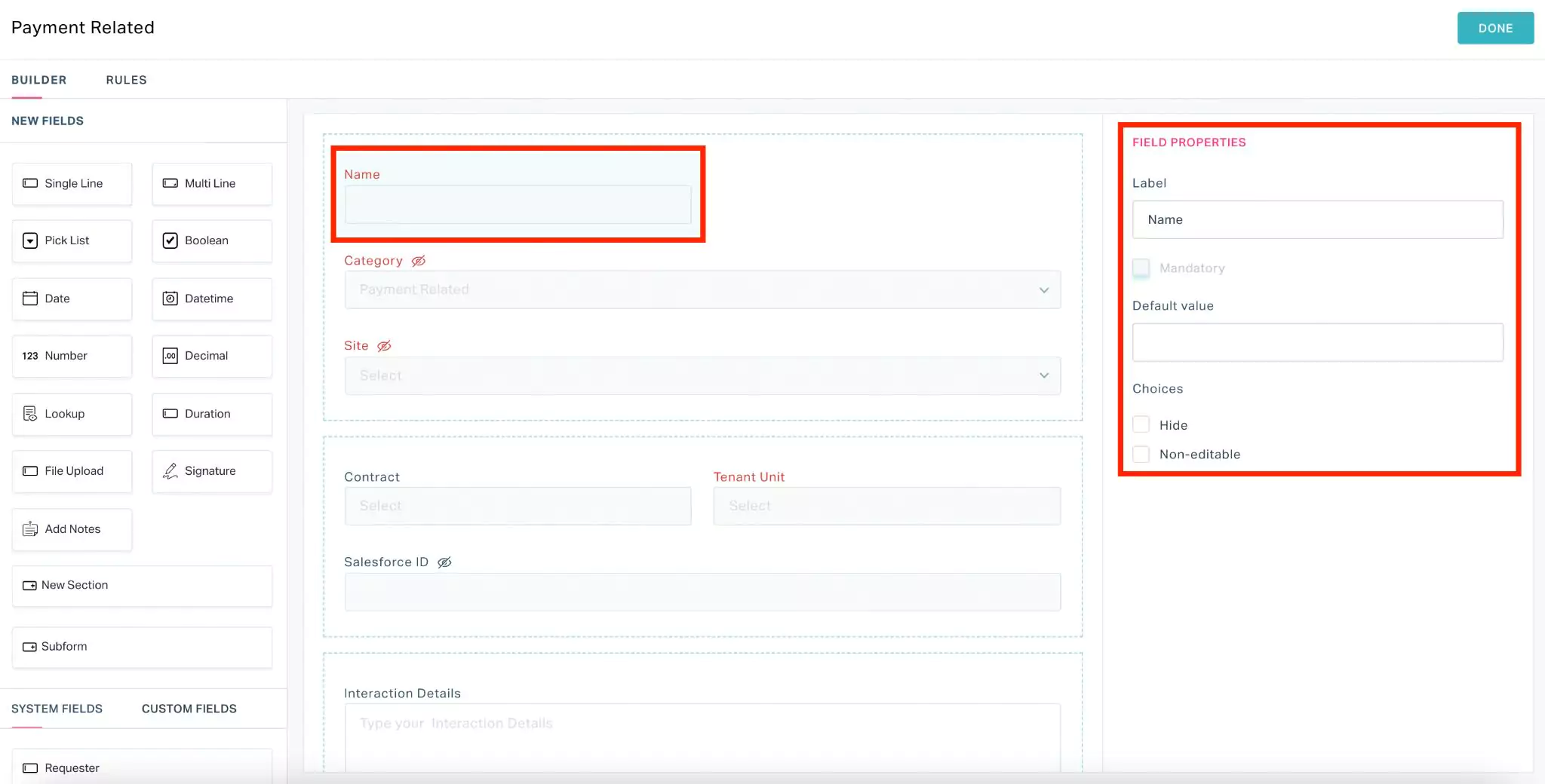
You can update the following fields as a part of field property configuration:
Label - To modify the field name
Mandatory - To indicate whether the field is mandatory
Default value - To configure the value to be displayed in the field by default
Example: In case of a boolean field, you can choose whether the field to be checked by default.In case of date and time fields, you can choose to display the current date and time by default.
Drop down values - To configure the values to be displayed in the drop down field.
Note: This field is applicable only for Picklist field type.Display Type - To configure the type display for the options associated with the field. The available options are,
- Radio and
- Checklist
Note: This field is applicable only for Boolean field type.Metric - To capture the type of measurement being recorded
Note: This field is applicable only for Number and Decimal field types.Unit - To capture the unit of measurement.
Note: This field is applicable only for Number and Decimal field types.Choices - To apply other required settings to the field. You can choose to,
Hide - Temporarily remove the field from the form
Non-editable - Refrain the user from updating the field
Allow Other Choices - Allow users to include other required options to the dropdown list.
Note: This field is applicable only for Picklist field type.Enable Color Palette - Allow users to choose colors other than black.
Note: This field is applicable only for Signature field type.
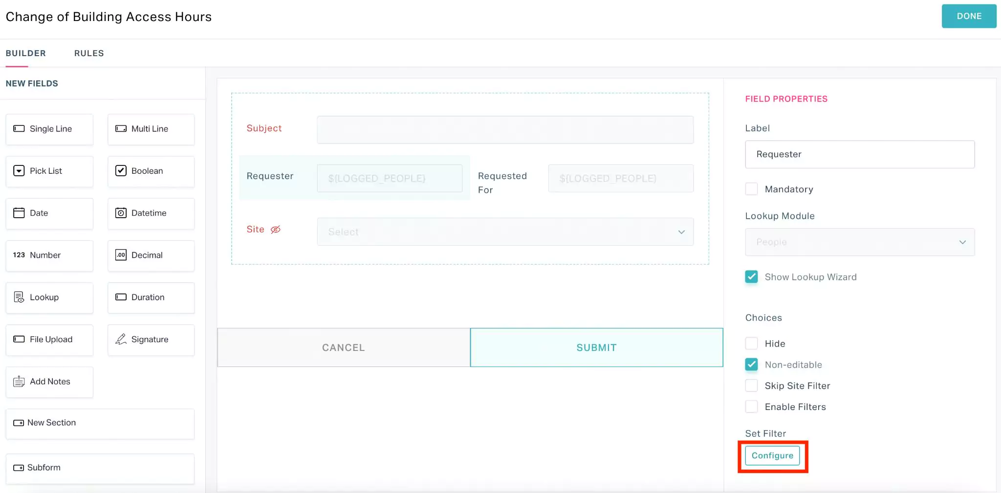
Configuring Filters for Field Values
The field values respective to the fields (for example, Building) are automatically looked up from the concerned modules (For example, Space Management).
Sometimes, it might be tiring for the users to scroll through the huge list of options to select a field value. To overcome this, you can customize the values to be displayed in a dropdown or selection window.
Perform the following steps to configure filters for customizing the field values displayed in a field:
Select a module and then select the required template for which the field values are to be configured.
Select a field and click Configure under the Set Filter field.
The Set Criteria window appears as shown below.

Set criteria based on the following filter options:
- Value
- Field
Note: You can configure multiple criteria in filter using the icon. Read the Configuring Value Filter and Configuring Field Filter sections for more information.
 Click SAVE. The field value filter is now applied to the selected field.
Similarly, you can configure filters for multiple fields in the template.
Click DONE at the top right of the form. The filter configurations are now applied to the field(s) in the template.
The upcoming sections explain in detail how to configure various types of filters.
Configuring Value Filter
This section explains how filters can be applied to the field values with respect to the value in another field. To configure a value filter,
Select a field in the template (for example, Requester) and click Configure.

Set a criteria using a value filter as shown below.

Click SAVE. The filter configuration is now applied to the selected field in the template.
Note: In the above scenario, only the active requesters are displayed for the users to select.
Configuring Field Filter
This section explains how filters can be applied to the field values with respect to the field values associated with another field. To configure a field filter,
Select a field (for example, Floor) in the template and click Configure.

Set a criteria using a field filter as shown below.

Click SAVE. The filter configuration is now applied to the selected field in the template.
Note: In the above scenario, only the floors concerning the selected building are displayed for the users to select.The fields corresponding to the selected module are displayed in the first drop down whereas, the fields displayed in the last dropdown are the fields in the working module.
Once the filter configuration is complete, the Configure button changes to Criteria Configured as shown below.

You can click on Edit or Reset to modify or remove the filter configuration, respectively.
Applying Rules
Rules can be applied to a form to configure it's behavior (for example, show or hide and enable or disable certain fields), under selected criteria (for example, when a particular site is selected). To configure a rule,
Select a module and then select the required template.
The BUILDER screen appears by default.

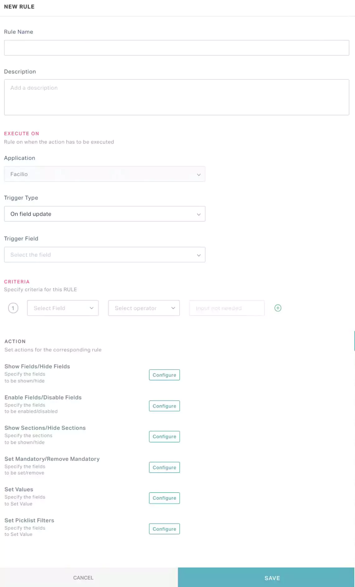
Navigate to the RULES section and click ADD FORM RULE. The NEW RULE window appears as shown below.
 Note: You can also configure rules while creating a new template (using the ADD TEMPLATE button) in association with any module.
Update the following fields in this screen.
Rule Name - Enter a title for the rule being configured
Description - Add a short description about the rule to be displayed for the user
Trigger Type - Select the type of behavior respective to the criteria and actions set. You can choose any of the following options:
Form on load - The configured criteria and actions are applied while loading the form.
Example: If a field 'Floor' is configured to be hidden on form load, the field will not appear when you open the form.On field update - The configured criteria and actions are applied respective to the trigger field value update.
Example: If a field 'Floor' is configured to be hidden on field update, the Trigger Field is 'Building' and the criteria is 'Building is Al Manzil' the field will disappear when you set the Building field in the form to Al Manzil.
Trigger Field - Select the field(s) that impacts the form's behavior.
Note: This field appears only if the Trigger Type field is set to On field update. This is a multi-select field.Criteria - Configure the condition(s) based on which the actions created are applied to the form. Read the Configuring Criteria section for more information.
Action - Configure the behavior of the form respective to the criteria created. Read the Configuring Actions section for more information.
The Application field indicates the application to which the rule is applicable. This field is auto-filled and cannot be modified.
Click SAVE. The rule is now applied to the template in the selected application.
Configuring Criteria
As a part of the rule, you can configure criteria upon setting a trigger field, and corresponding operator and input value (as applicable) in the following fields:

Field - Select a field on which the condition is to be applied.
Note: The values in the drop down list are the fields available in the form. If the Trigger Type field was set to On field update, the criteria configured for a field are applicable only if the same field was set in the Trigger Field.Operator - Select the operation or comparison methodology to be applied. You can choose any of the following possible operators:
- Is empty
- Is not empty
- Is
- Isn't
- Role is
- Date related operators (like, Yesterday, starting tomorrow, last month, this week and so on)
- Numeric operators (like, !=, >=, >, between and so on)
- String operators (like, contains, starts with, ends with and so on)
Note: The operators displayed vary with respect to the field chosen.Value - Enter the field input for which the condition applies.
Note: The applicability of this field depends on the operator set. For example, if the operator is set to 'Is empty' this field is not applicable.
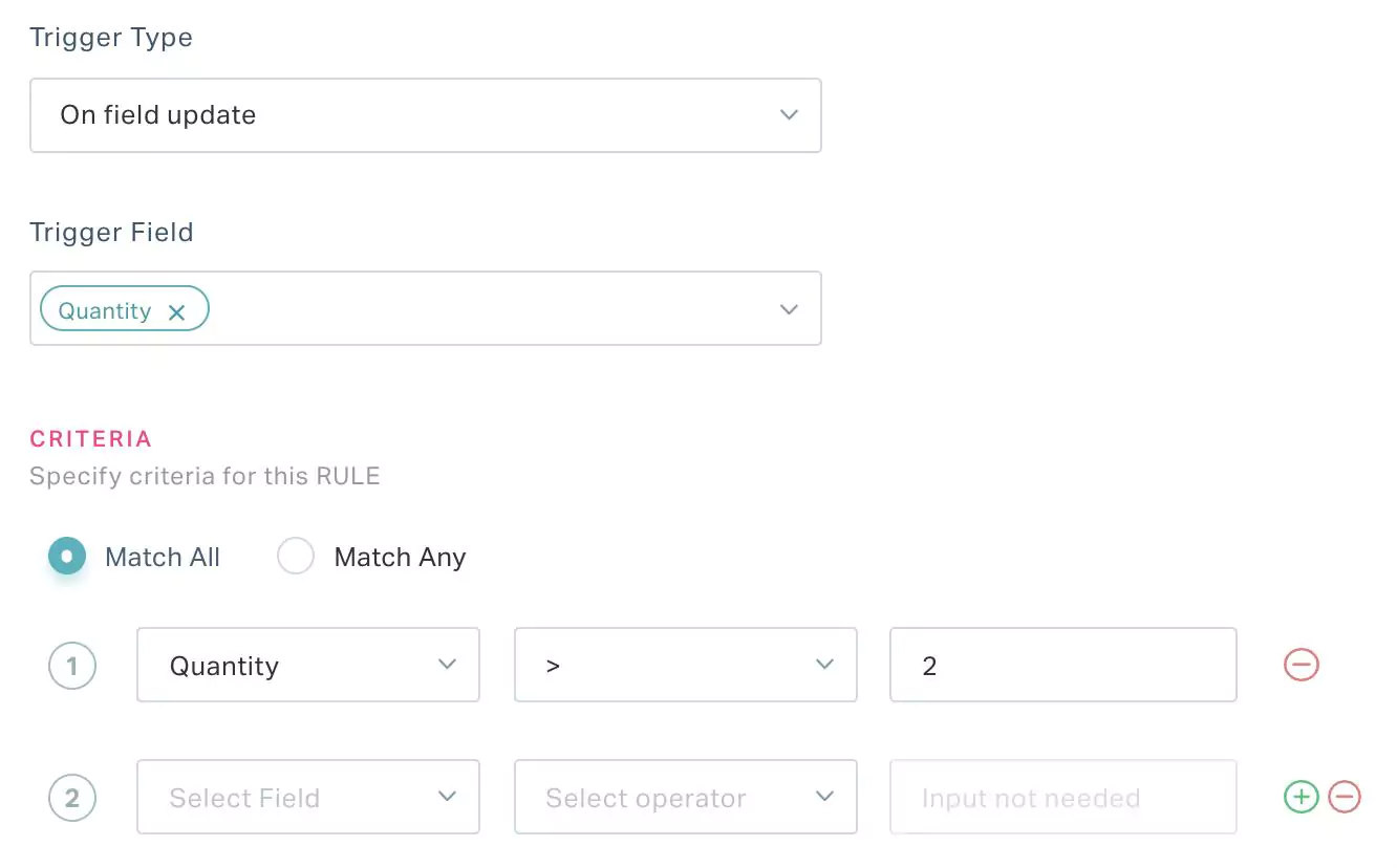
Here, the configured action(s) are applied to the form when the Quantity is more than 2.
The criteria created in the NEW RULE screen is specific to the rule associated with the form.
You can use the  and
and  buttons to add or delete a record in this section. In case of multiple criteria, you can choose to match all or selected criteria using the Match All and Match Any options.
Configuring Actions
As a part of the rule, you can configure any of the following actions (upon clicking Configure against the action) that will be applied when the criteria created are met:
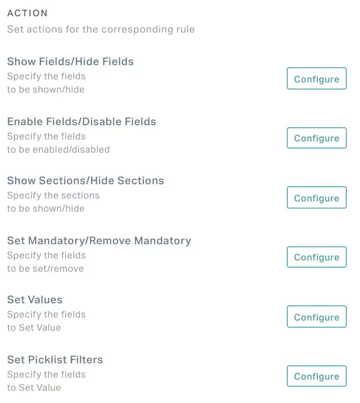
Show Fields/Hide Fields - Configure additional field(s) to be shown and irrelevant field(s) to be hidden in the following window.
 Note: The fields in this window are multi-select.
Enable Fields/Disable Fields - Configure the applicable field(s) to be enabled and inapplicable field(s) to be disabled (that is, non-editable or grayed-out) in the following window.

Show Sections/Hide Sections - Configure additional section(s) to be shown and irrelevant section(s) to be hidden in the following window.

Set Mandatory/Remove Mandatory - Configure important field(s) to be updated compulsorily and less required field(s) to be removed being mandatory in the following window.

Set Values - Set a default value to be updated for the selected field(s).
Set Picklist Filters - Select a field and hide irrelevant values from the drop down list in the following window.

All the changes to the form are autosaved. You can click DONE at the top right to save the changes and return to the previous (module details) screen.
All the changes to the form are autosaved. You can click DONE at the top right to save the changes and return to the previous (module details) screen. You can control the access permission of a template by role using the  (Vertical ellipsis) icon associated with the template.