Customizing Tabs And Layout
The Portals module of the application makes the portal layout absolutely customizable, that is, it allows the organization of the tab groups and tabs in the user interface. Portal layouts are primarily managed through roles. In other words, the layout of a portal varies for users with different roles assigned to them (read the Roles Management section for more information).
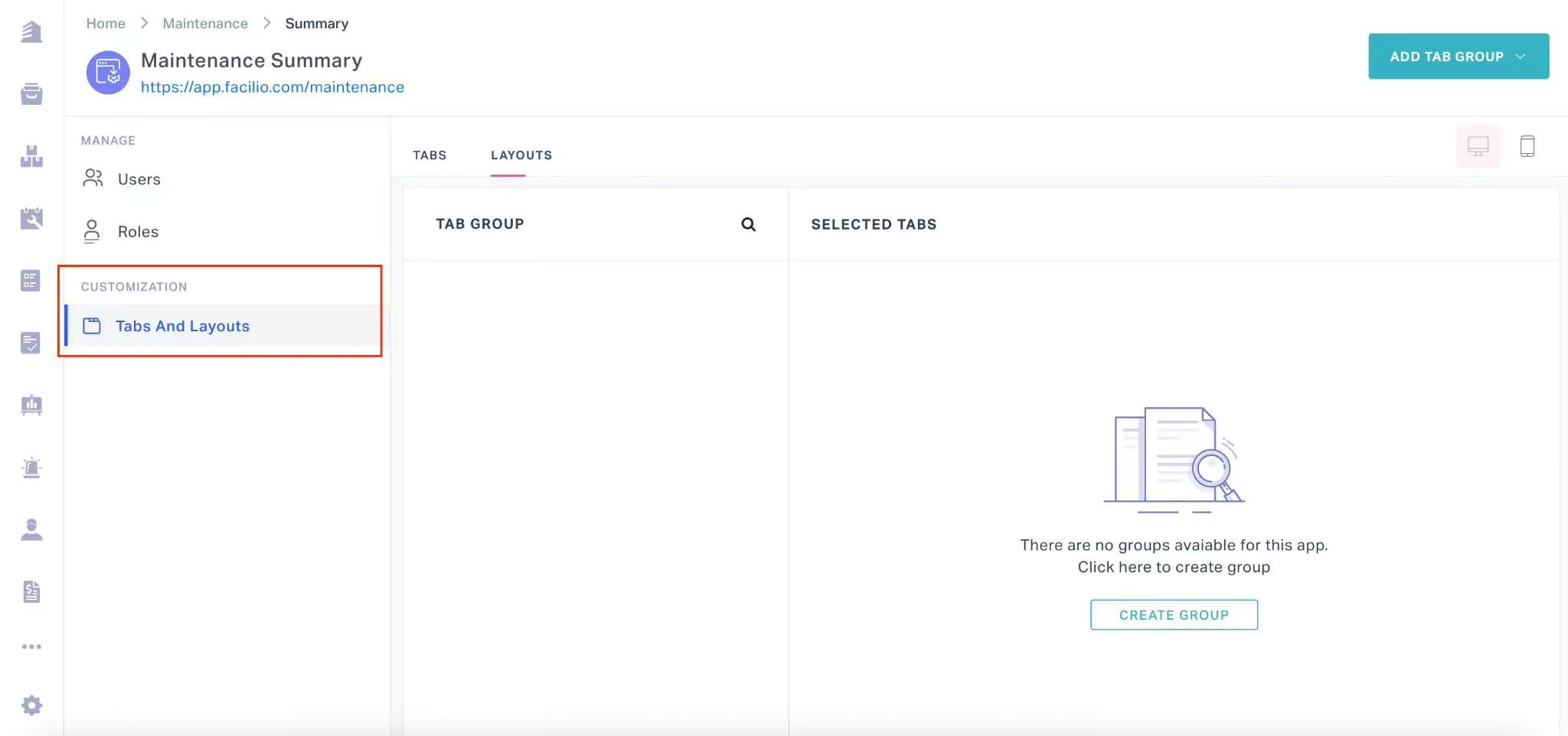
Also, It is crucial for an administrator to maintain the repository of tabs and configure the default arrangement of the tabs within the appropriate tab groups. The following picture depicts a sample portal layout configuration.

You can navigate to the Tabs And Layout section of the portal summary screen to customize the layout.
The upcoming sections explain how to create and manage tabs and tab groups, and configure the portal layout.
Creating Tabs
A tab is the basic component of a layout. It is mandatory to create and maintain the list of tabs prior to the configuration of portal layout. To create a new tab,
Navigate to the TABS view in the Tabs And Layout section as shown below.
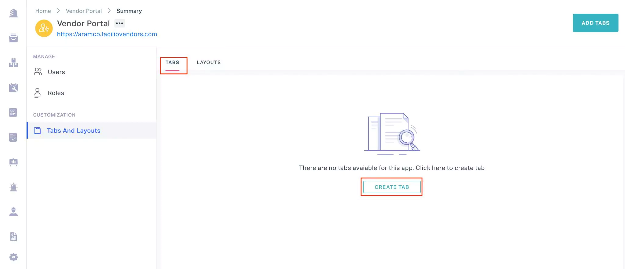
Click CREATE TAB. The TAB TYPES window appears as shown below.

Select any of the following options from the TabType dropdown:
- Module - To add any module configured as a part of the main application.Example: You can add both system and custom modules.
- Approval - To allow access for items awaiting approval in selected modules.
- Report - To add a section that provides you with the analytics of readings and alarms that are triggered as a part of the selected modules
- Analytics - To add a section that provides you with charts based on the data points configured
- Dashboard - To add all or required dashboards configured as a part of the main application
- Connected App - To add any connected app created as a part of the main application.
- Timeline - To add the timeline based views configured as a part of the selected modules. Example: In the Workorder module, the Overdue and Due Today are timeline based views.
- WebView - To be added
- Module - To add any module configured as a part of the main application.
Click CONFIRM. The ADD TAB window appears for the selected tab type.
Note: The fields may vary with respect to the tab type selected.
Update the Name (tab name), Module (the module(s) from which the required information will be fetched) and other fields, if any.
Click SAVE. The new tab is now successfully added to the Tab section.
Creating Tab Groups
A tab group is a container that holds the tabs. Creating necessary tab groups and grouping the appropriate tabs together helps the users to easily navigate to the required sections. To create a new tab group,
Navigate to the LAYOUTS view in the Tabs And Layout section as shown below.
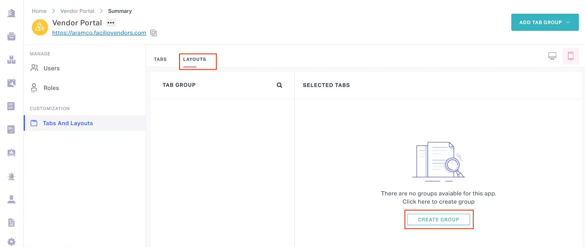
Click CREATE GROUP. The ADD TAB GROUP window appears as shown below.
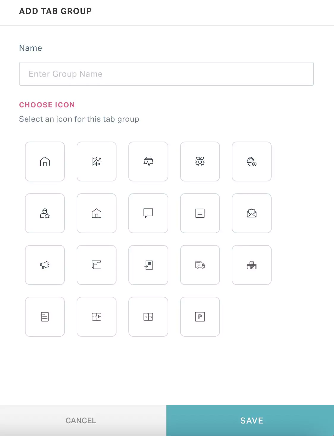
Update the group name and select an icon for the tab group.
Click SAVE. A new group is now created as shown below.
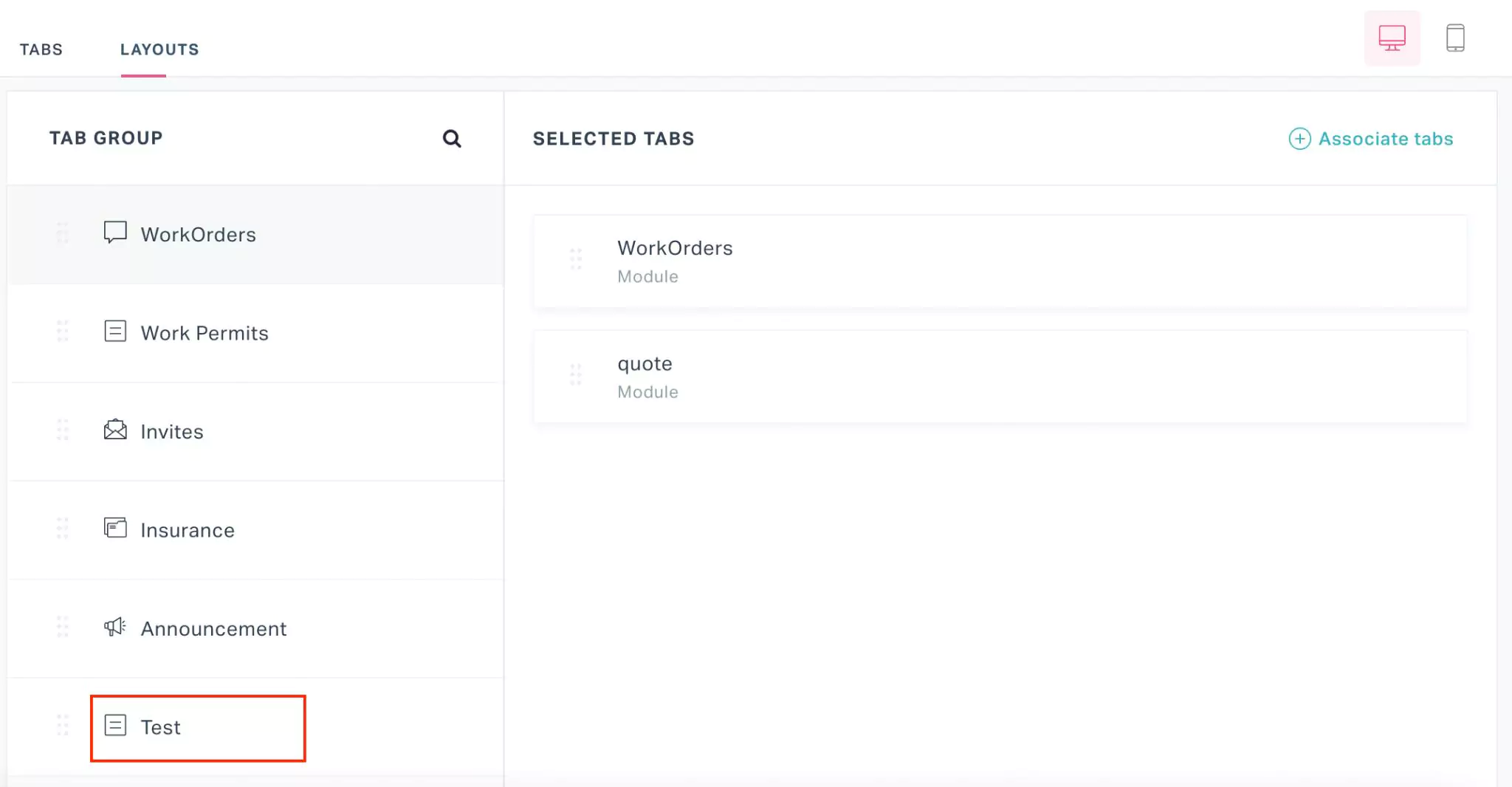
Associating Tabs to Tab Groups
Creating the portal layout is the most important phase of the portal creation process. Once the required tabs and tab groups are created, you should arrange them effectively in such a way that the users don’t have to strain or scroll through the entire portal to access the required section.
All required tabs must be organized into the appropriate tab groups so as to complete the layout configuration. To associate tabs to a tab group,
Select the required tab group in the LAYOUTS section and click ASSOCIATE TABS as shown below.
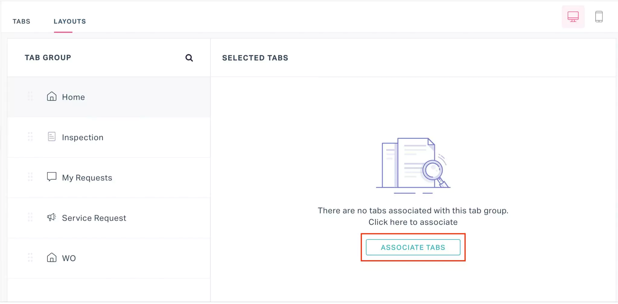
The ASSOCIATE TAB window appears.
Choose the required tabs to be organized under the selected tab group and click ASSOCIATE. The tab(s) are now displayed in the SELECTED TABS section as shown below.
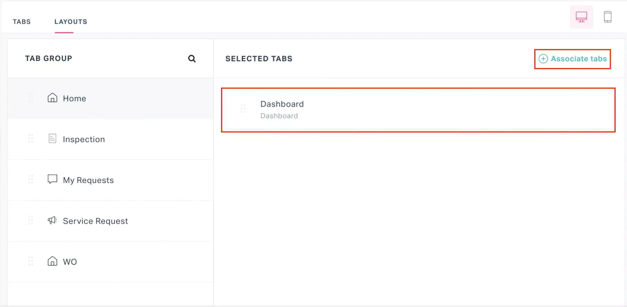
You can use the Associate tabs button highlighted in the above screenshot to add more tabs under the same tab group.
 icon corresponding to them.
 The application allows you to configure different layout for web and mobile views. You can use the  (desktop) and
  (mobile) icons to navigate to the appropriate sections.
 and
and  icons corresponding to a tab or tab group are used to edit and delete it, respectively. Any changes to the layout configuration in this screen will be applied to the portal with immediate effect.