Working with Analytics
Every organization has its own way of collecting data regarding any aspect. Furthermore, deploying advanced analytics strategies covering all operation metrics can help derive the required reports and offer recommendations to the end-users.
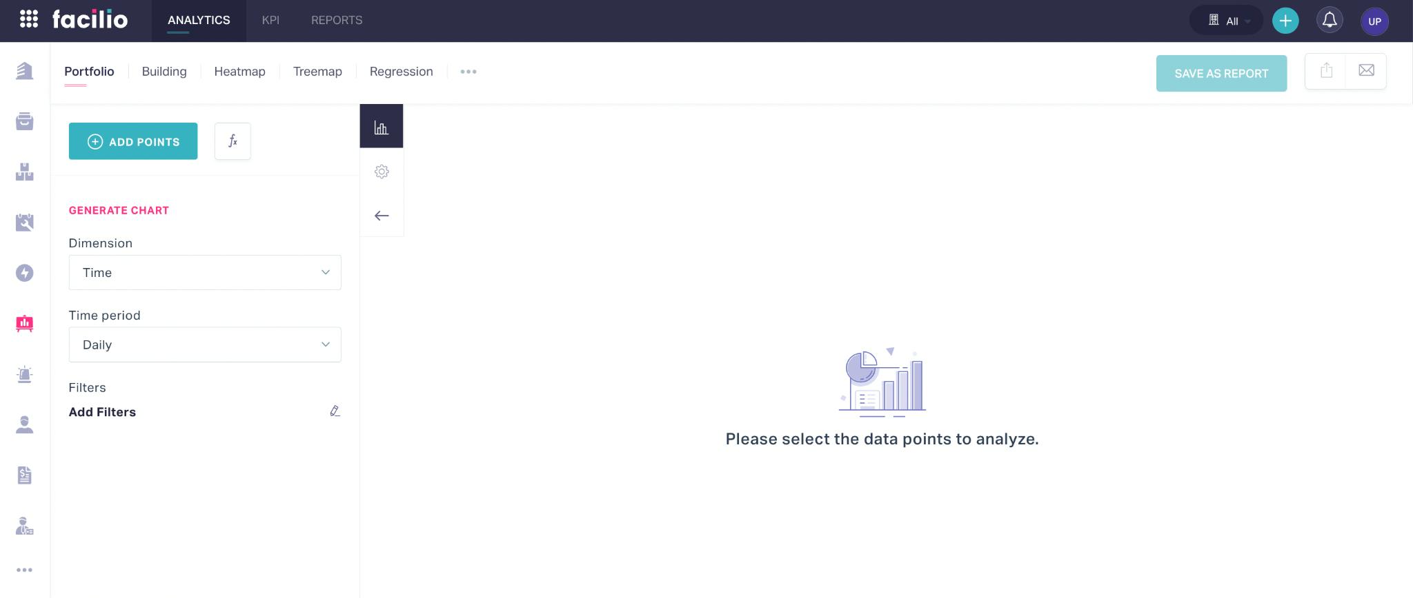
The Analytics module of the application allows you to create distinct reports on various aspects of facility management. To navigate to this module, click the ![]() (Analytics) icon in the sidebar menu. The analytics configuration window for Portfolio appears by default, as shown below.
(Analytics) icon in the sidebar menu. The analytics configuration window for Portfolio appears by default, as shown below.
The upcoming sections explain the varied analytical report generation processes, customizing the features and settings of a report, and other functionalities included in this module.
Illustrating Data Representation
This section explains how to create various analytical representations for the data gathered across the modules.
Defining Building Analytics
Analytics for building allows you to create a specialized report involving the data points grouped under the following parameters:
Assets - To compare and contrast water, power, and energy readings associated with various assets and present the data in different formats to understand the trend.
Example: You can capture the energy reading for a particular energy meter or monitor the temperature of the water that is ejected from a chiller and compare the same with the readings of previous day, month, quarter or year to arrive at a conclusion on the trend and analyze the reason.
Space - To compare and analyze all data associated with a particular space within a site or building. For example, you can capture the energy or power consumption reading for a building and compare the same with the readings of previous day, month, quarter or year, or the bill generated from the particular utility provider.
Weather - To compare different variants of weather data, from daily temperature to rainfall distribution.
EnPI (Energy Performance Indicator) - To analyze the overall energy consumption of individual spaces and assets across different sites.
Rules - To analyze the criteria configured for triggering alarms, work orders, service requests, and so on.
M&V (Measurement and Verification) -
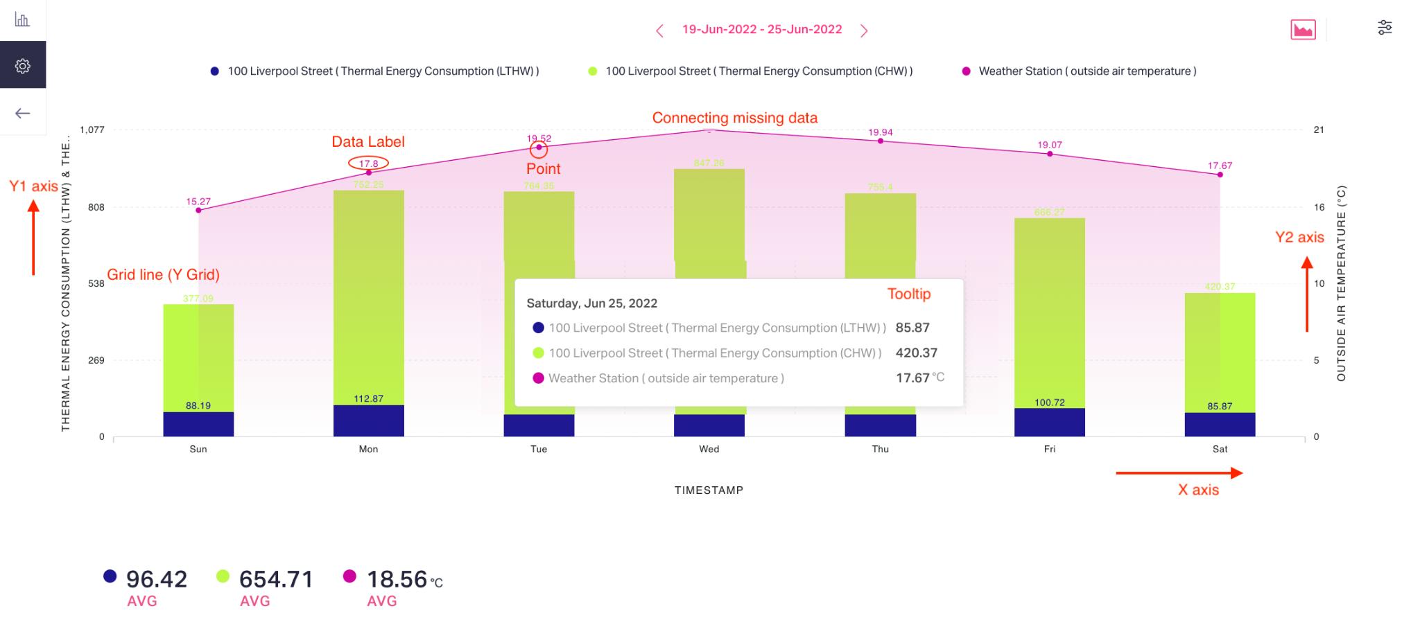
Let us create an analytical report that depicts the thermal energy consumption of a selected asset against the weather. To generate an analytics report corresponding to a building,
Navigate to the Building section under ANALYTICS.
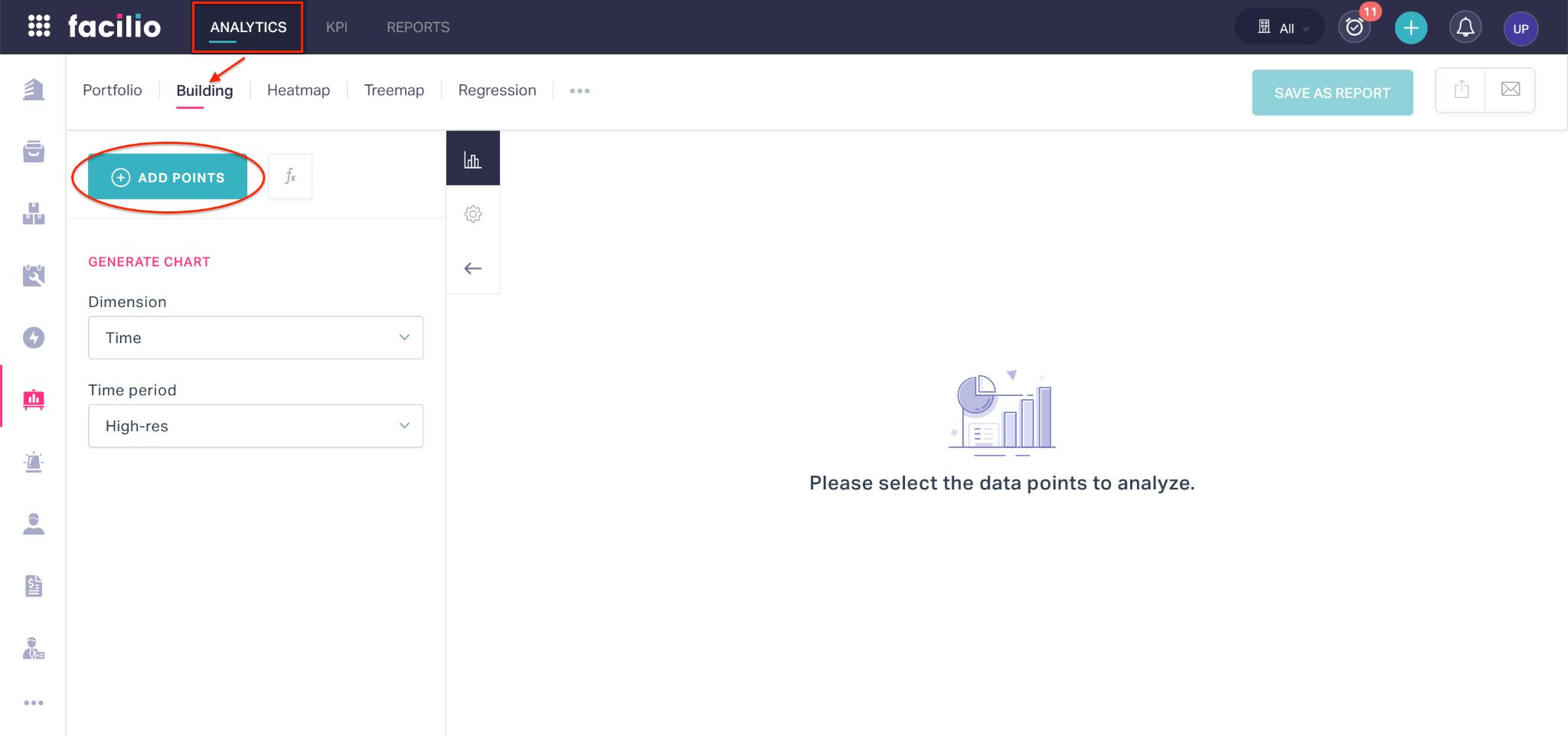
Click ADD POINTS.
Select a building from the dropdown and configure appropriate data points (for example, LTHW and CHW) to be analyzed corresponding to the asset as shown below.
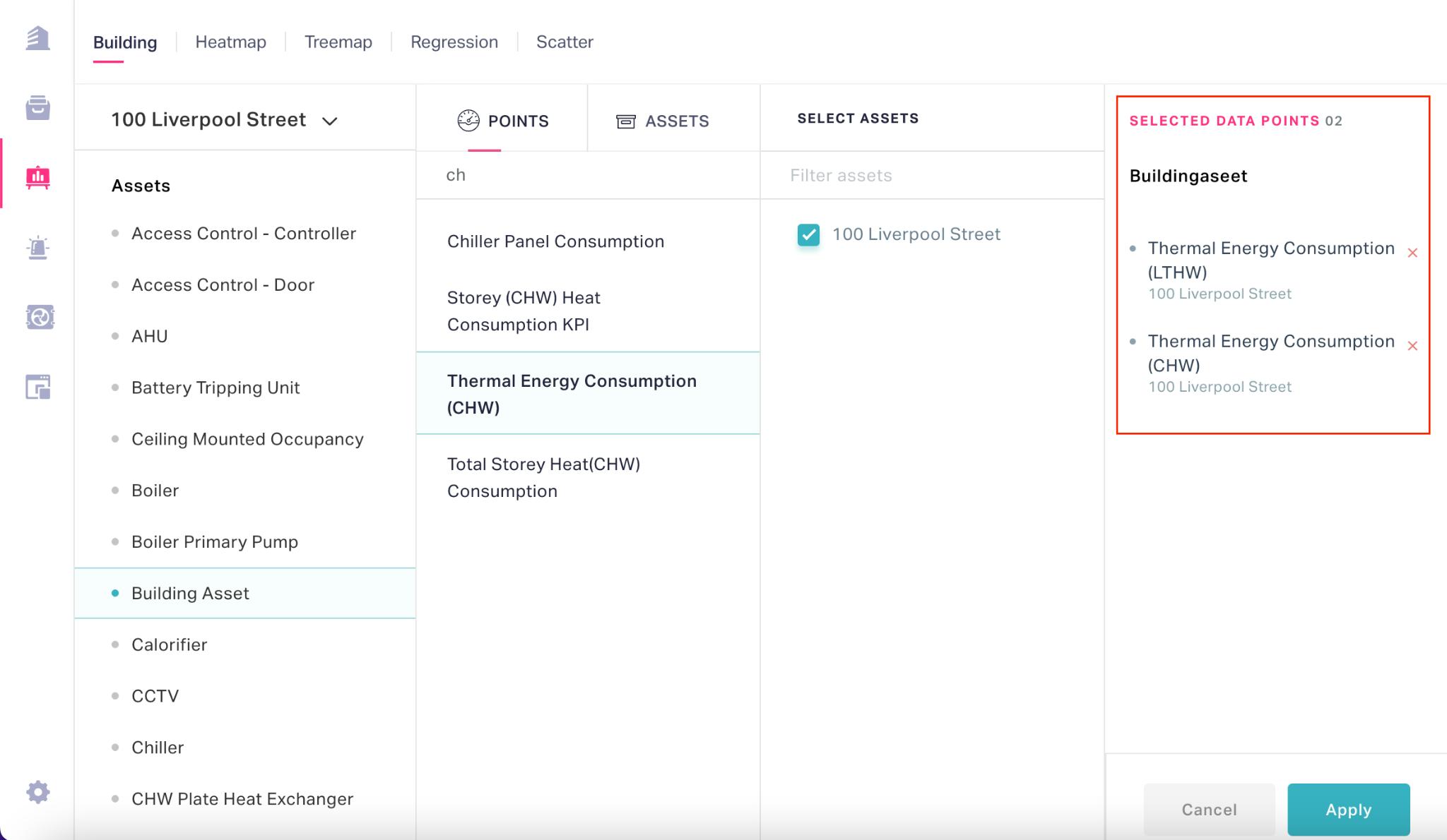
Note: The summary of the selected data points are displayed in the SELECTED DATA POINTS section as shown above. You can use the
 icon corresponding to the data point to remove it from the list.
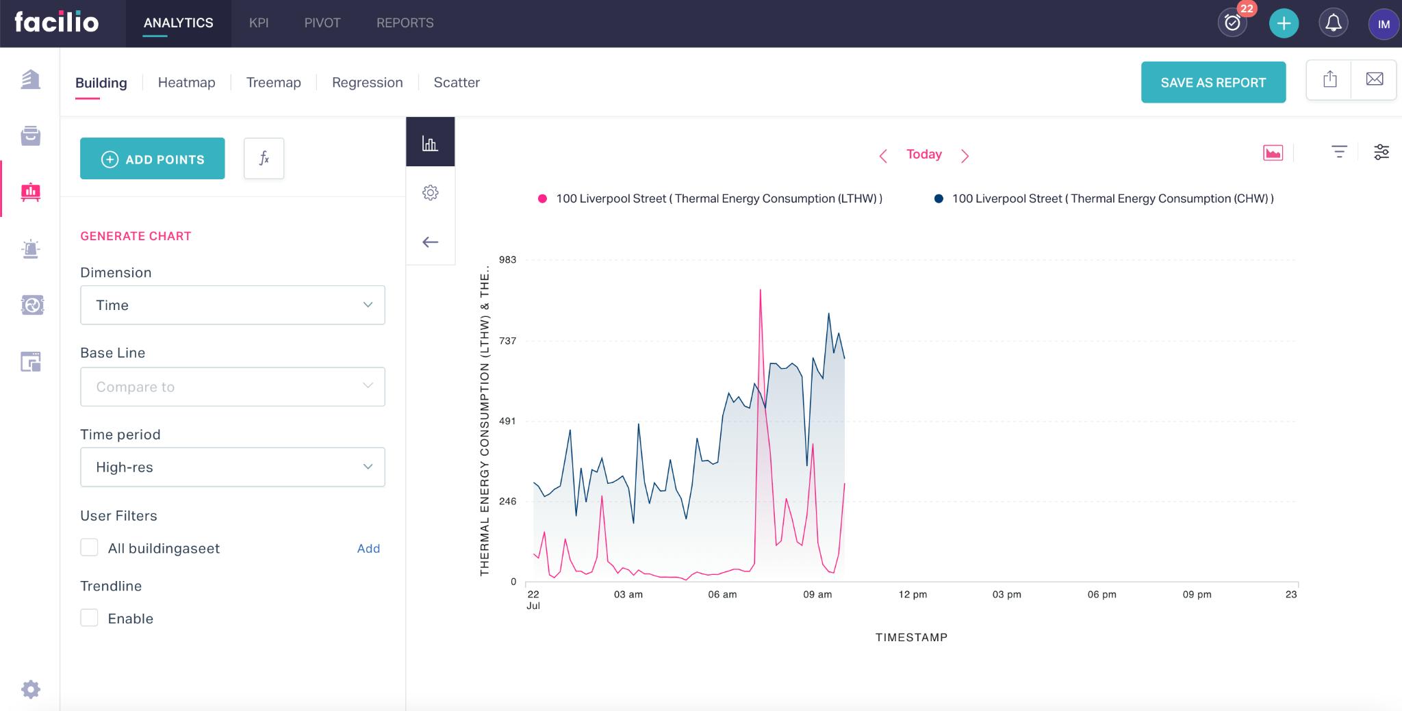
Click Apply. The attributes of the selected asset are plotted as a line graph (by default), as shown below.
Click ADD POINTS again and include the weather station data in the chart as shown below.
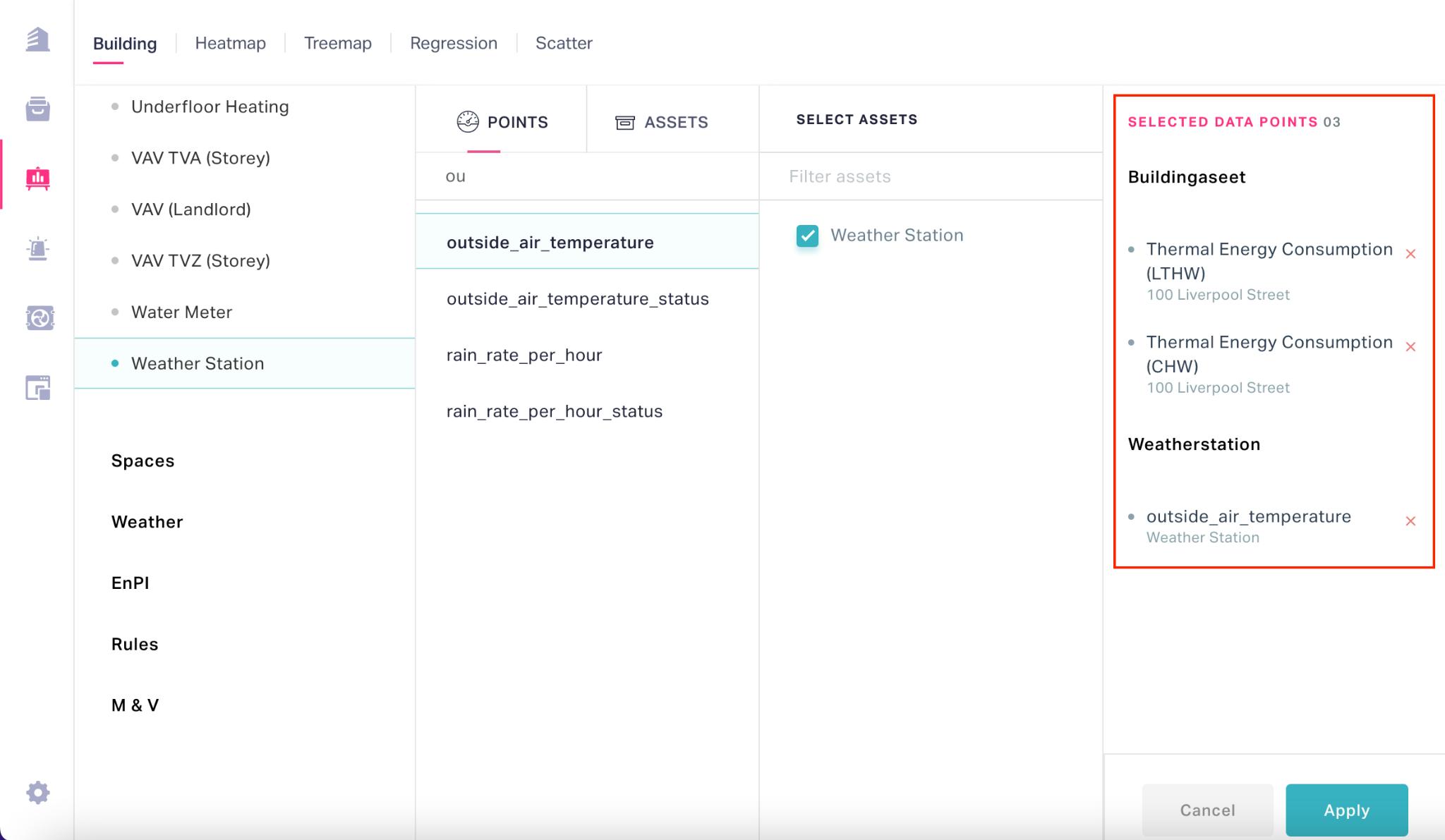
Note: The SELECTED DATA POINTS section is updated with the new set of data points.
Click Apply. Now, the weather station data is displayed in the chart enabling you to analyze the energy readings with reference to it.

Note: You can always customize the data and display settings of the chart as required for better interpretation. Read the Customizing Report Settings section for more information.
Customizing Report Settings
A report must be a self-explanatory schematic representation of data that depicts the facts, figures, information, conclusions, and recommendations in a clear manner. The preceding sections explain how to extensively customize every aspect of analytics to tweak and tailor the data as required and display the information that makes the most sense to the facility managers.
Configuring Basic Settings
This section explains customizing the chart type, data filters and field display settings of a report.
Chart Type
You can select the best way to represent your data by using the appropriate chart type. Click the ![]() (Change chart type) icon to change the chart type of the report or the representation of individual data points.
(Change chart type) icon to change the chart type of the report or the representation of individual data points.
Filter Options
This feature allows you to define criteria for qualifying data, based on which you can modify the report and generate charts specific to your requirement. You can use the ![]() (Filter) icon to filter the data respective to the report. The application provides you with the following ways to refine the data set.
(Filter) icon to filter the data respective to the report. The application provides you with the following ways to refine the data set.
Time Filter
The TIME FILTER section allows you to filter the data that falls within a certain day(s) of a week and/or a time range.
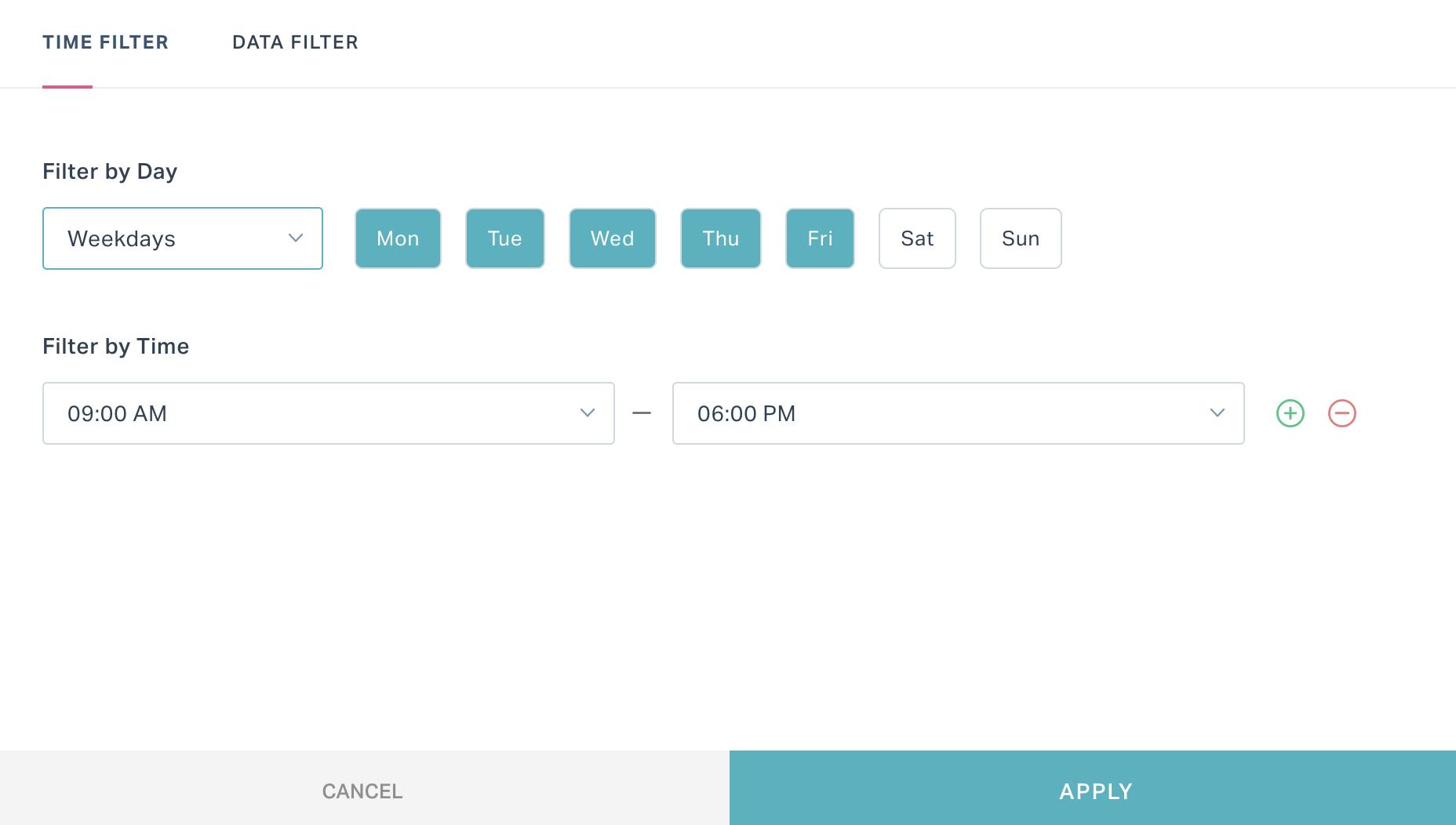
For example, you can filter the data that falls on weekdays between 9 AM and 6 PM as shown above.
Data Filter
The DATA FILTER section allows you to filter the data with respect to a specific criteria.
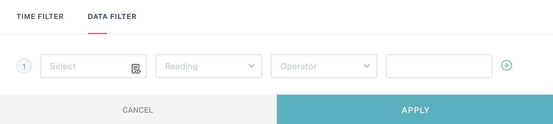
The attributes to configure as a part of the data filter vary based on the data points involved in the report.
Example: In case the asset readings are analyzed, you can filter the data points of a particular asset whose readings match certain criteria.
In this scenario, you should define the following attributes to apply the data filter to the report:
Asset - The asset whose data must be filtered.
Note: The assets listed in the drop-down field correspond to the selected building.
Reading - The data point for which the filter criteria must be specified
Operator - Select the operation or comparison methodology to be applied. You can choose any of the following possible operators:
- Is empty
- Is not empty
- Is
- Isn't
- Role is
- Date related operators (like, Yesterday, starting tomorrow, last month, this week and so on)
- Numeric operators (like, !=, >=, >, between and so on)
- String operators (like, contains, starts with, ends with and so on)
Note: The operators displayed vary with respect to the reading chosen.
Value - Enter the input value for which the condition applies.
Note: The applicability of this field depends on the operator set. For example, if the operator is set to 'Is empty' this field is not applicable.
Example: A sample criterion configuration is shown in the screenshot below.
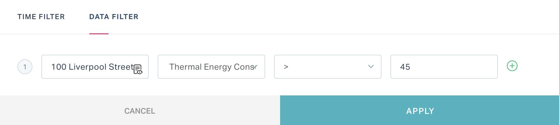
Here, the thermal energy consumption (LTHW) readings lesser than 45°C are discarded in the report.
The criteria created is specific to the selected report. You can use the ![]() and
and ![]() icons to add or delete a condition in this window.
icons to add or delete a condition in this window.
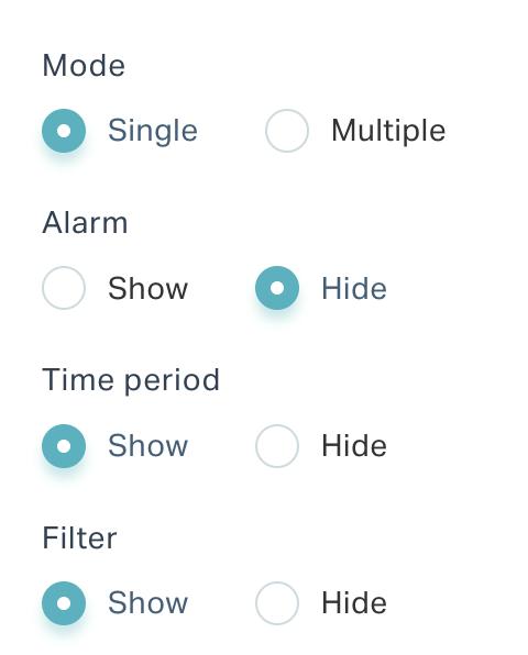
Report Settings
You can configure the chart mode, and enable or disable the display of the various components in a report (like, data filter representation, frequency modifier dropdown, and so on) making it more comprehensive.
You can use the ![]() (Report Settings) icon to configure these display settings of the report.
(Report Settings) icon to configure these display settings of the report.
Configuring Data Settings
Using the fields in the GENERATE CHART section, you can include a few elements in the report for better analytical insights.
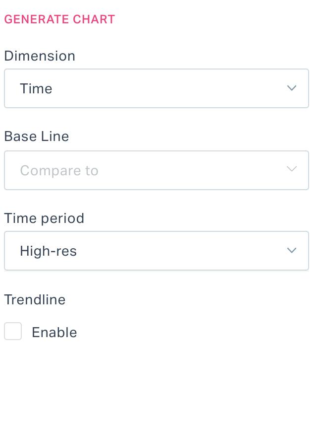
You can add the following components to the report:
Dimension - The attribute based on which the selected data point values are represented in the report.
Example: If this field is set to 'Floor' and the data point chosen is CCTV availability, the generated report depicts the floor wise device availability status.
Baseline - To compare one set of data with another set.
Example: If you set this field to Previous Week, the previous week's data for the selected attributes will be plotted against the existing report to compare the trend.
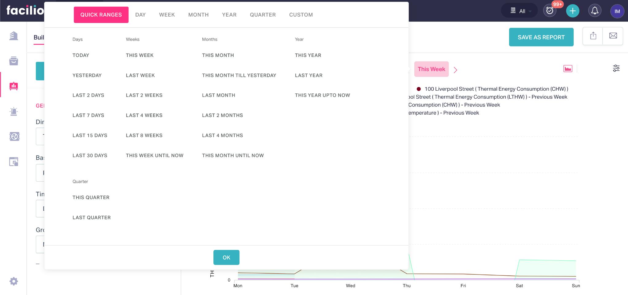
Time Period - To define the interval (for example, hourly, daily or weekly) to break down the entire data that belong to the specified duration (for example, today, last week or this year) for analysis.
Note: The data that falls under the duration specified using the date and time range picker (as shown below) is considered for generating the report.
Trendline - To interpret the results upon generating an upward or downward line on the chart indicating the course of the data point readings reported over a time period. You can enable or disable the trendline based on the requirement.
User Filter - To define the criteria for qualifying the data to be represented in the report.
Sort By - To specify the data point based on which the….
Sort Order - To arrange the configured data points in ascending or descending order in the report
Limit - To set maximum number of data points to be represented in the report
Note: The fields displayed in this section may vary with respect to the dimension selected.
Customizing Chart Settings
Custom charts allow you to visualize the collected analytics data as clear and legible reports. In general, customization makes your chart look better by modifying certain features and display options. This section explains how to effectively alter the appearance of a report chart.
Let us assume that we have already created a basic chart choosing the required data points. The first iteration of a chart usually looks a bit rough. You can navigate to the CHART CUSTOMIZATION section by clicking the ![]() icon to configure the following features and settings of the report, refining it to a meaningful representation.
icon to configure the following features and settings of the report, refining it to a meaningful representation.
Data Points
The DATA POINTS section displays the list of data points configured as a part of the report.
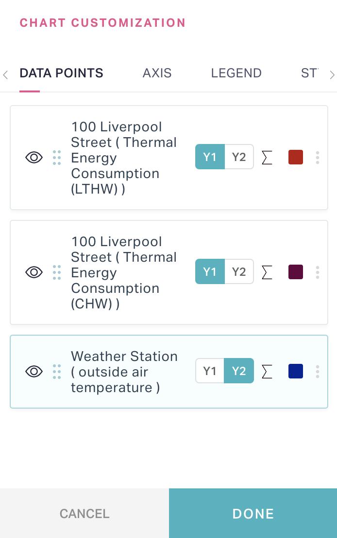
You can use the following elements or options in this section to customize the representation of the data points and their readings in the report:
 - To switch the axis (Y1 or Y2) of the data point on the chart
 - To set the aggregation type for the data in the report.
Note: The default aggregation type used in the reports is Sum.
 - To change the color code of the particular data point representation in the chart.
Note: Alternatively, you also click the color icon corresponding to a data point in the report legend to change the color of data point representation in the chart.

 - To temporarily enable or disable the data point in the report -->
Note: You can also directly click on a data point in the report legend to hide or unhide the data point in the report.
You can use the following icons to organize the data points, thereby improving the visual comfort:
 - To rearrange the data points in this section by simply clicking and dragging this icon
 - To create a group to identify and aggregate similar data points, make a duplicate copy of the data point with different aggregation method (for comparison) or delete a data point in the report.
Note: You can simply double click on the data point label in this section to rename it as required.
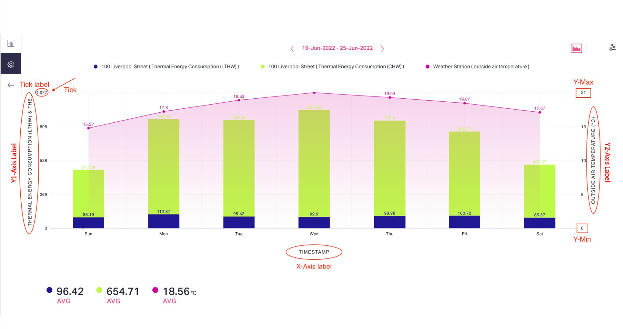
Axis
The AXIS section allows you to configure the elements and settings specific to both X and Y axes in the report.
You can configure the following settings as a part of this section:
X-AXIS
This section allows you to configure the below attributes:
- X-Axis Label - To rename the X axis label
- Rotate Axis - To rotate the chart towards left
- Tick Direction - To customize the orientation of the tick labels
Y-AXIS
This section allows you to configure the below attributes:
Y-Axis Label - To rename the Y axis label
Y-Min - To set the minimum tick value in the Y axis
Y-Max - To set the maximum tick value in the Y axis
Tick Counts - To define the number of ticks in the Y axis
Decimal - To specify the number of decimal points displayed in the tick values
Format Value - To format the representation of the tick values. You can choose any of the following notations:
- Thousands (K)
- Lacs (L)
- Millions (M)
- Crores (C)
This field is set to None by default, which displays the actual tick values.
Note: You can switch between Y1-Axis and Y2-Axis tabs in this section to configure the respective attributes. You can show or hide the Y1 and Y2 axes in the report by enabling or disabling the respective Show field.
Legend
The LEGEND section allows you to define the positioning of the report legends and the aggregation method that applies to the widget legend values.
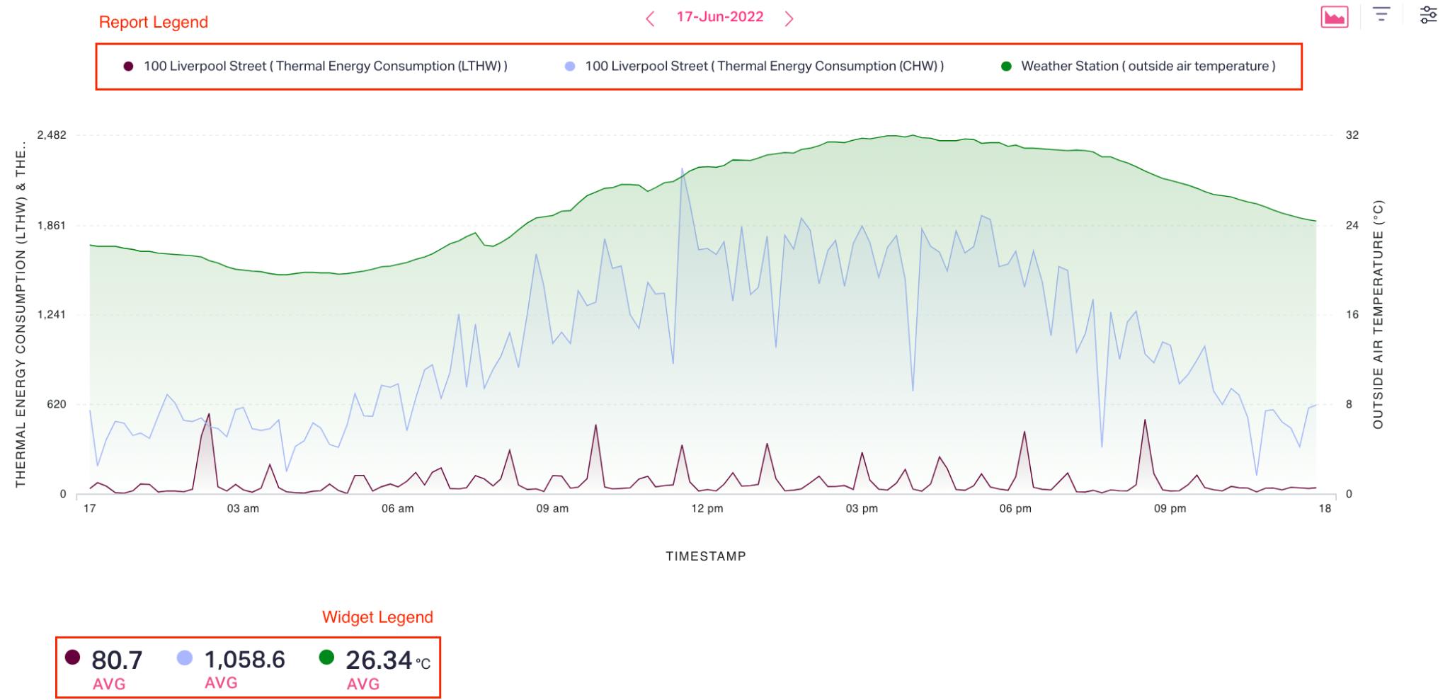
In this section you can,
Position the chart legend at the top, right or left sides of the report.
Show or hide the chart and widget legends in the report by enabling or disabling the respective Show field.
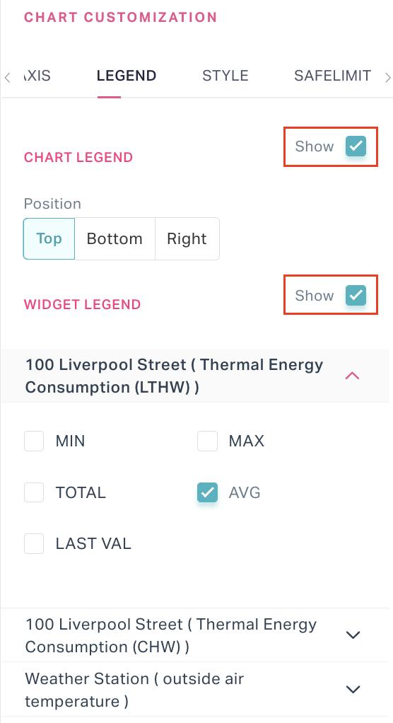
Choose the aggregation method to be applied to the individual data points in the widget legend.
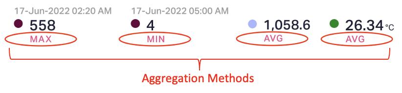
You can configure the widget legend to display the minimum, maximum, total, average, or last value recorded for the data points.
Style
The STYLE section allows you to customize the display settings of the chart making it more convenient for the users to interpret the results.
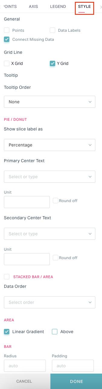
You can configure the following settings as a part of this section:
General
In this section you can configure the attributes that are common across all chart types.
This section allows you to,
- Enable or disable the following fields:
- Points - To hide or unhide the coordinate points in the report
- Data Labels - To hide or unhide the data labels as required
- Connect Missing Data - To complete the graph patching the missing points
- Enable grid lines for the selected axis or axes
- Rearrange the tooltip data in ascending or descending order
Pie or Donut Chart
The Pie or Donut charts are circular charts that make part-to-whole relationships, which are easy to grasp at a glance. In this section you can configure the attributes that are specific to these chart types.
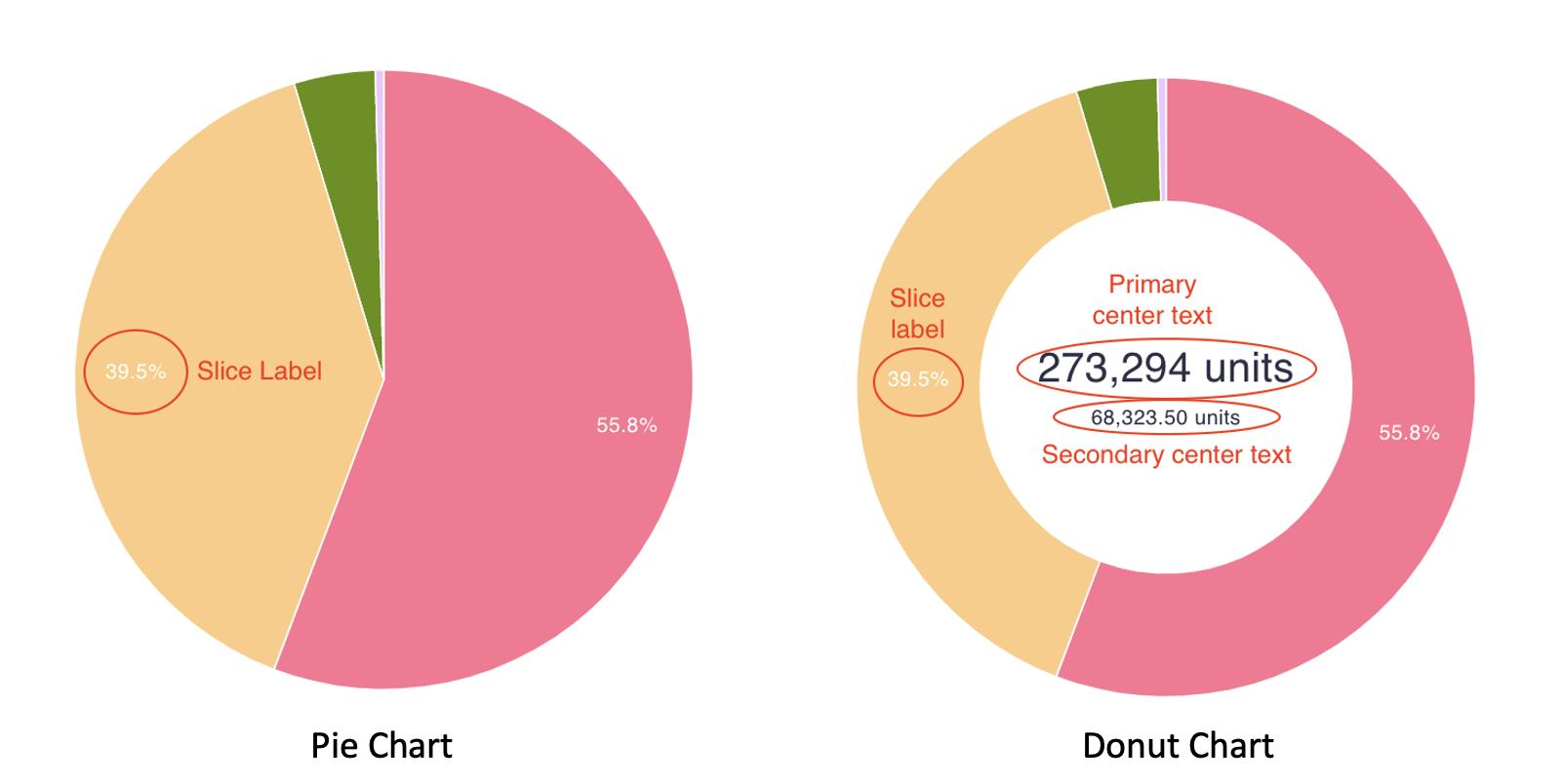
This section allows you to,
- Configure the slice label to display the actual value or percentages
- Define the aggregation type, unit, and rounding-off policy to be applied over the primary and secondary center texts.
Note: The center texts apply only for the donut charts.
Others (Stacked/Bar/Area Charts)
In this section you can configure the other settings that are specific to the stacked, bar and area charts. This section allows you to,
- Define the data order (ascending or descending) in stacked graph charts.
- Configure the color fill settings for the area chart. You can enable the Linear Gradient field to avoid solid filling. Also, you can specify whether to color outside or inside the chart by enabling or disabling the Above field.
- Specify the radius and padding of the bars in the stacked and bar graphs.
Table
This section allows you to hide or unhide the index column of the report table.
Safelimit
This section lists all the data points configured as a part of the report. Selecting the data points generates a safety limit, helping identify the instances crossing the bounded value.
Note: The fields displayed in the above sections of CHART CUSTOMIZATION window may vary with respect to the data points chosen. The safety line appears on the chart only when the admin has configured the safety limit for the selected reading.
Saving the Report
The application allows you to store reports created in this module under pertinent folders and even publish them to the dashboard. To save a report created,
Click SAVE REPORT at the top right.
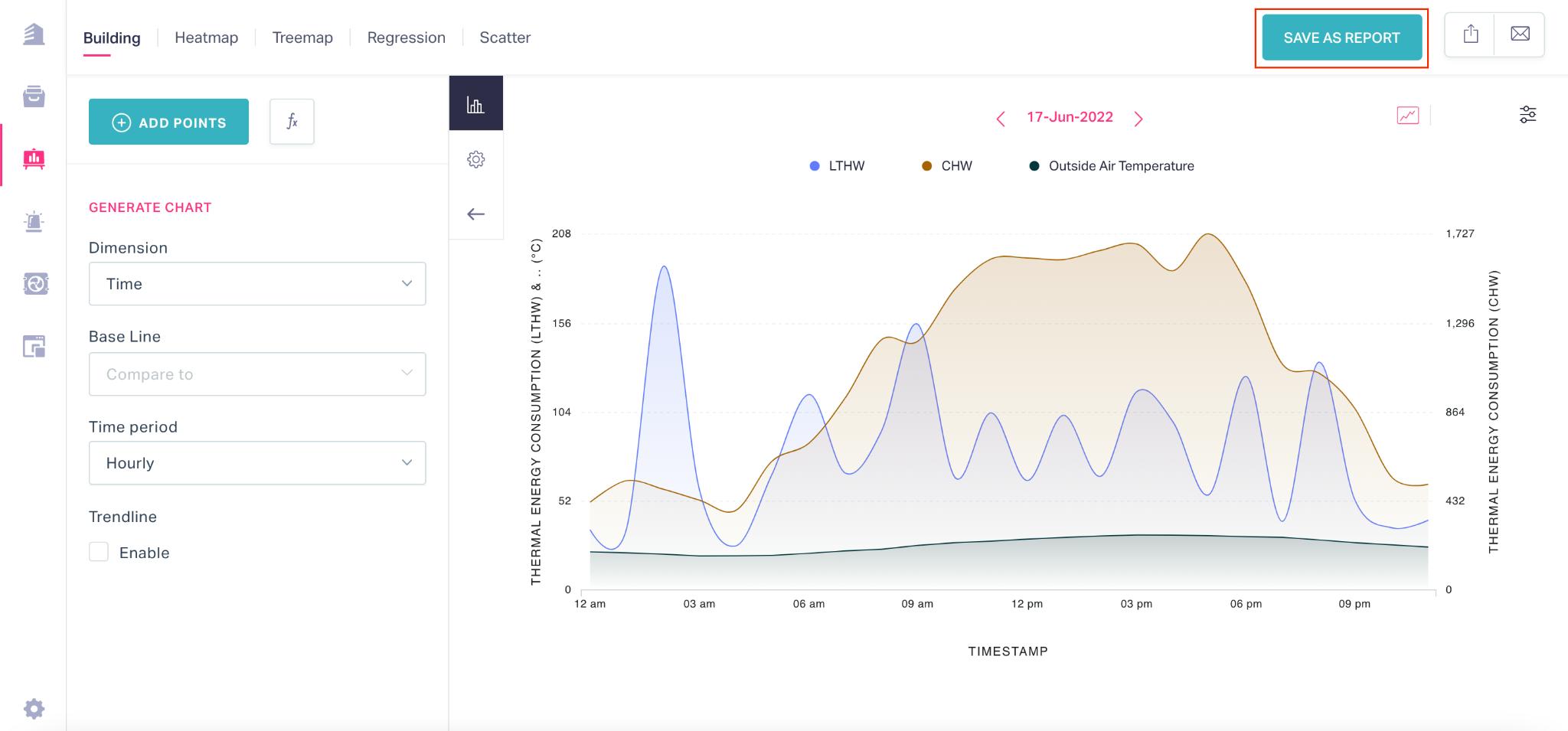
The SAVE AS REPORT dialog appears as shown below.
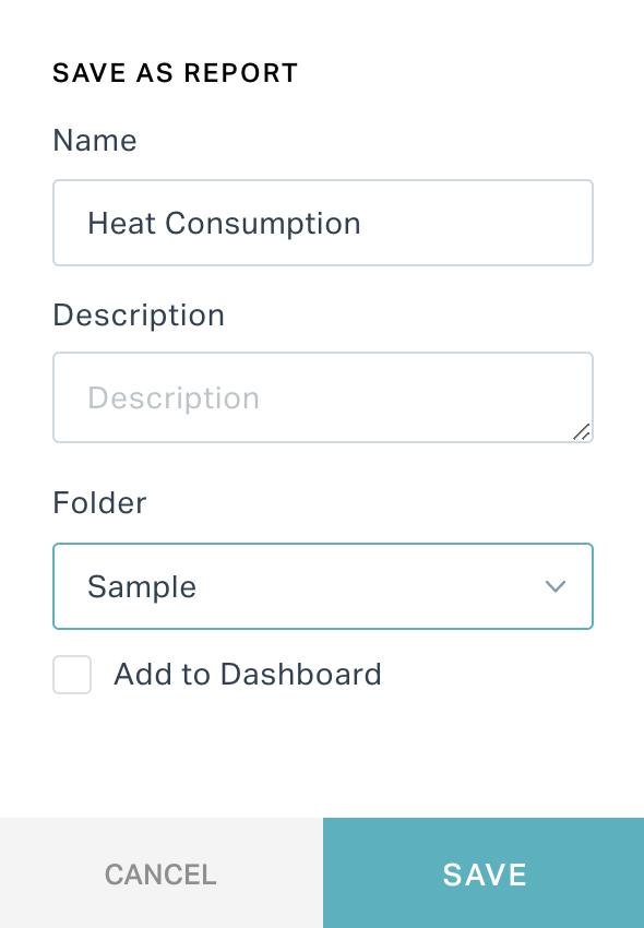
Update the following fields in this screen.
Name - The name of the report
Description - A short description explaining the purpose of the report
Folder - The folder where the report must be saved
Note: You can choose an existing folder or create a new folder to save the report.
Enable the Add to Dashboard field if you want to publish the report to the dashboard.
Click SAVE. The report generated is now successfully saved.
You can retrieve the saved reports from the REPORTS section as shown below.
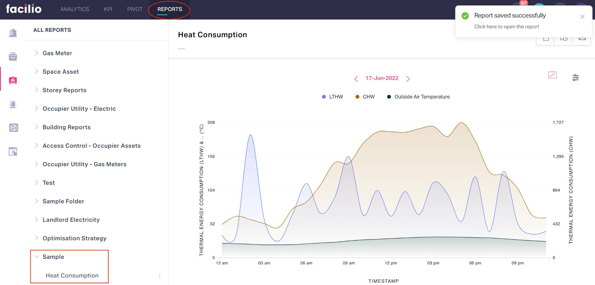
Note: The report thus created can be later enabled on the dashboard directly from the dashboard. Read the Add Component section in the Views and Dashboard feature for more information.
Sharing the Report
The application allows you to extract the reports generated in this module and even share it with the users instantly or automatically on a periodic basis, based on the requirement.
Exporting the Report
You can export a report as CSV or Excel file using the ![]() (Export) icon at the top right of the report. Read the Exporting Data section in the Basic Features and Functionalities feature for more information.
(Export) icon at the top right of the report. Read the Exporting Data section in the Basic Features and Functionalities feature for more information.
Scheduling Report
You can schedule certain reports to be generated and have them delivered through email to the selected users using the ![]() (Schedule this report) icon at the top right of the report. You can configure the application to trigger reports on a specific date and time or defined interval. Read the Scheduling Reports section in the Basic Features and Functionalities feature for more information.
(Schedule this report) icon at the top right of the report. You can configure the application to trigger reports on a specific date and time or defined interval. Read the Scheduling Reports section in the Basic Features and Functionalities feature for more information.
Note: This option is applicable only for selected reports with respect to the data points chosen.
Sending an Email
You can export a report in the required format and share it with selected users through email using the ![]() (Email this Report) icon at the top right of the report. Read the Sending Email section in the Basic Features and Functionalities feature for more information.
(Email this Report) icon at the top right of the report. Read the Sending Email section in the Basic Features and Functionalities feature for more information.
Printing the Report
You can print the report generated or save it as a PDF using the ![]() (Print) icon at the top right of the report.
(Print) icon at the top right of the report.
Note: The ![]() (Schedule this report) and
(Schedule this report) and ![]() (Print) features are applicable only for selected reports with respect to the data points chosen.
(Print) features are applicable only for selected reports with respect to the data points chosen.
Other Functionalities
There are certain functionalities and icons associated with this module that facilitate various other activities over the reports generated and the folders where they are organized.
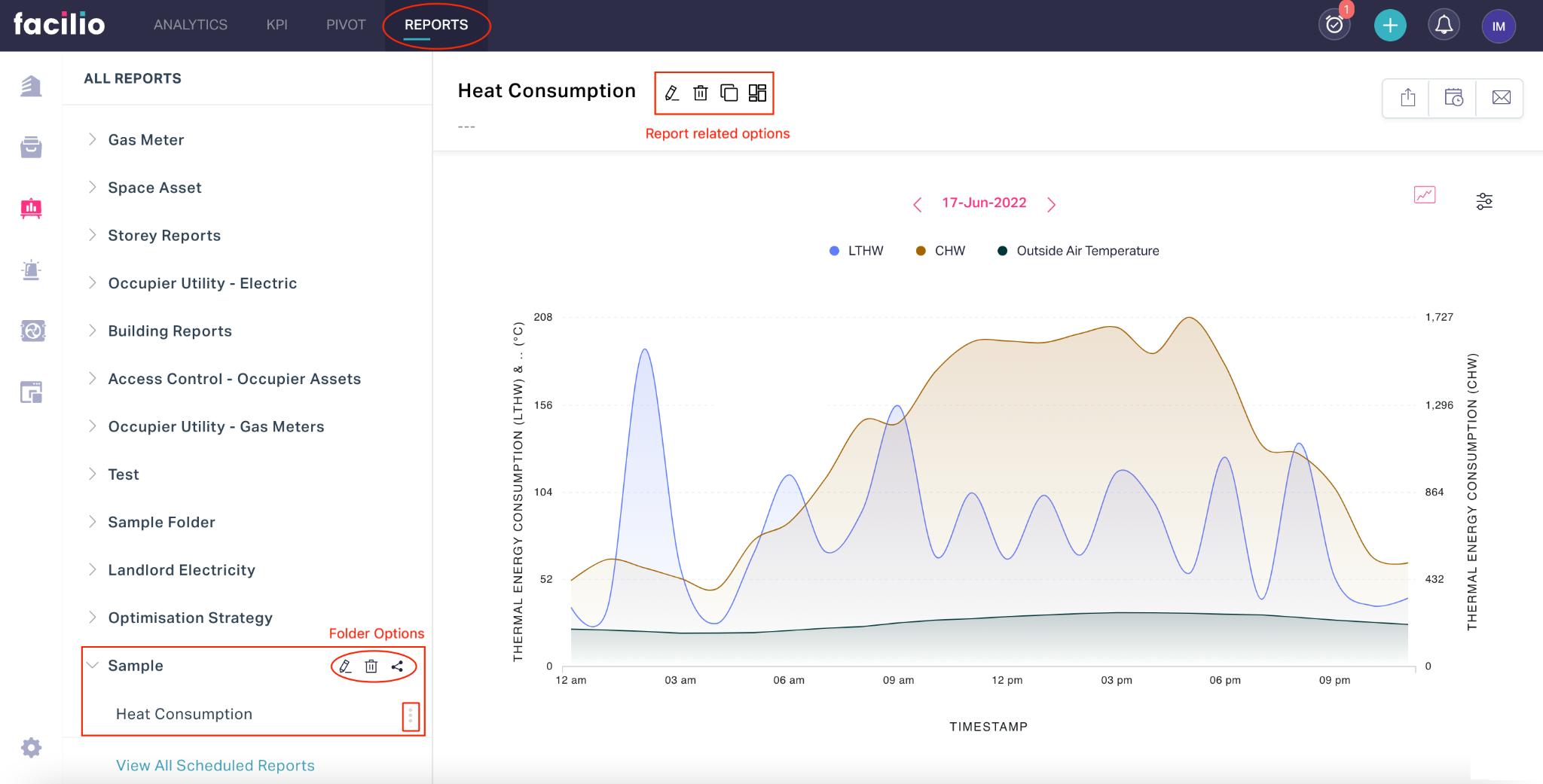
They are,
| Option Type | Icon | Action/Description |
|---|---|---|
| Report | Used to modify the data points, display settings and other properties of the report | |
| Used to delete a report permanently from the application | ||
| Used to create a duplicate copy of the report | ||
| Used to enable the report in a dashboard. Note: You can choose an existing dashboard or create a new dashboard to enable the report. | ||
| Folder | Used to modify the name of the reports folder | |
| Used to permanently delete the report folder. Note: You can delete only the empty folders in this section. | ||
| Used to configure access restriction for the report Note: By default any report created is shared with everyone. You can configure the users or the group of users who can access the report or disable access to all other users. | ||
| Used to move or organize the report under another folder |