Creating Pivot Table
Pivot tables excel at summarizing a vast array of statistics in a simple style to obtain a desired report. This table ensures a solid data analysis providing insight to make reliable decisions. It allows you to reorganize and sort data from a table by briefing and aggregating information based on different criteria.
You can create pivot tables to regulate the data, analyze performance for reporting and communication, manage assets, and effectively handle budgeting, cost control, and more.
To create a pivot,
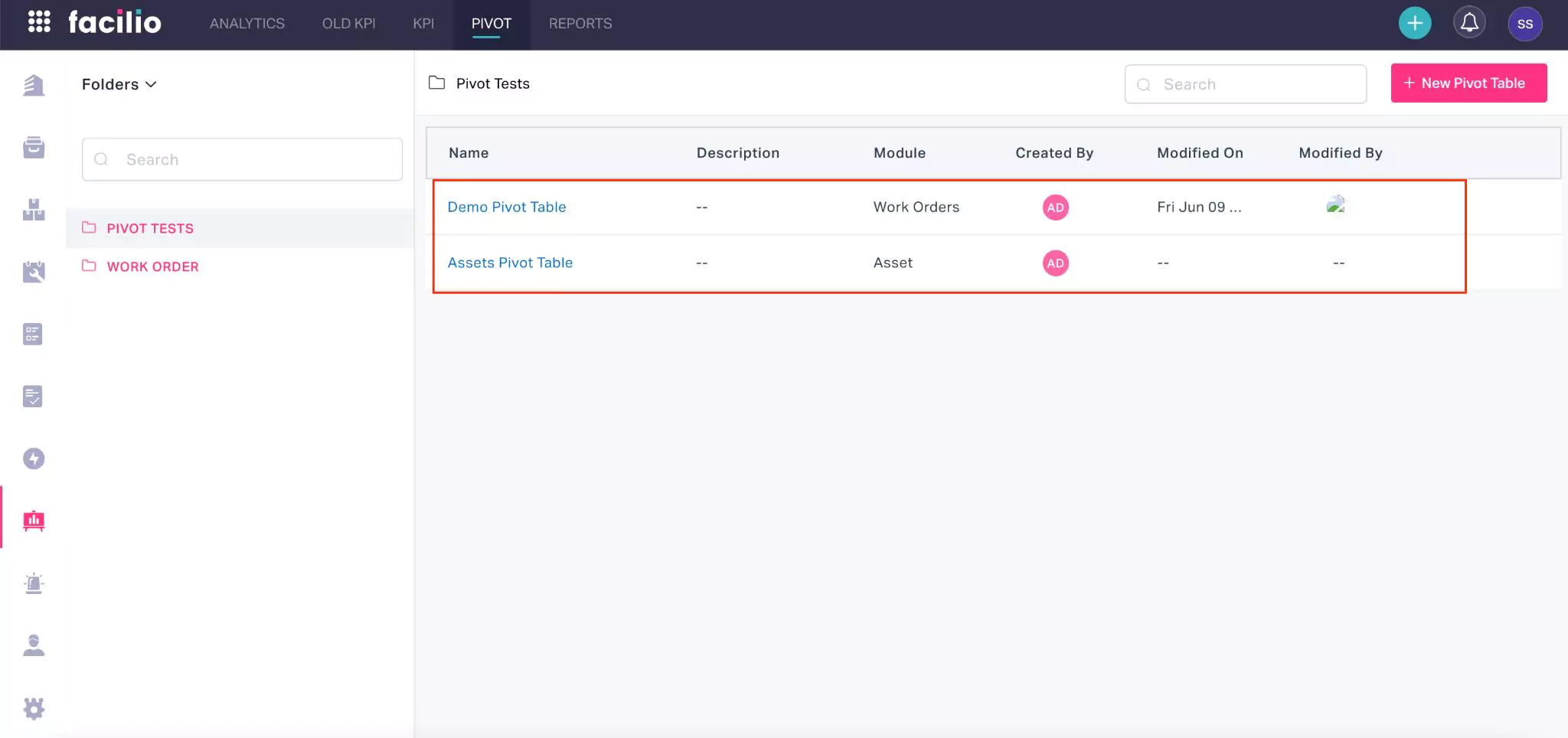
Navigate to the PIVOT section.The configured pivot tables appear as shown below.
Click +New Pivot Table. The New Pivot Table window appears.
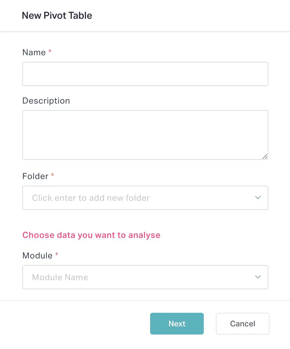
Update the following fields in the above screen:
Name - A label to identify the pivot table
Description - A short note explaining the need for a pivot table
Folder - The folder where the pivot table is being saved
Note: You can choose the existing folder or create a new folder by adding the folder name in the field.Module - The module corresponding to which the pivot table is being created
Click NEXT. The screen to customize the pivot table appears, as shown below.

Add the required rows and values to create a pivot table. Read the Adding Rows and Values section for more information.
Click SAVE. The pivot table is saved successfully.
The upcoming sections will provide explanations on the configuration, possible customizations, and visualizations within the pivot table.
Adding Rows and Values
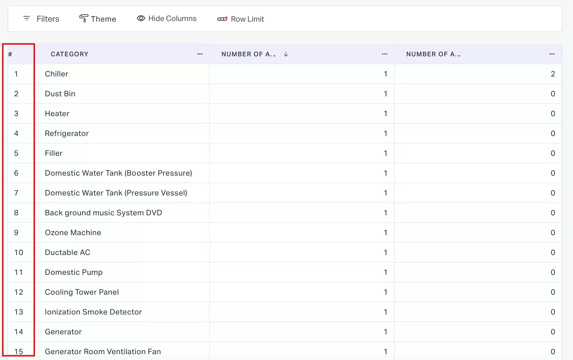
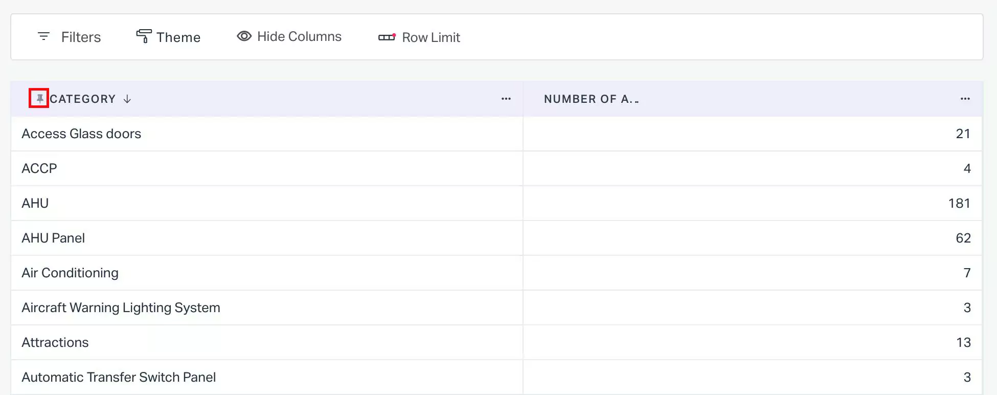
You can add rows and corresponding values from the Dimensions and Measures sections, respectively. In a pivot table, a row represents a specific category or grouping of data, while the value in that row indicates the total or aggregate value for that particular category. For example, in an asset data pivot table, a row might represent a specific asset category, while the value in that row would represent the total asset count in that category. The values are computed and displayed based on the measuring parameters set, such as count, sum, average, minimum, or maximum value.
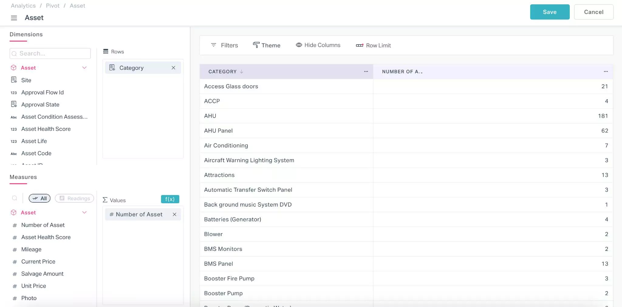
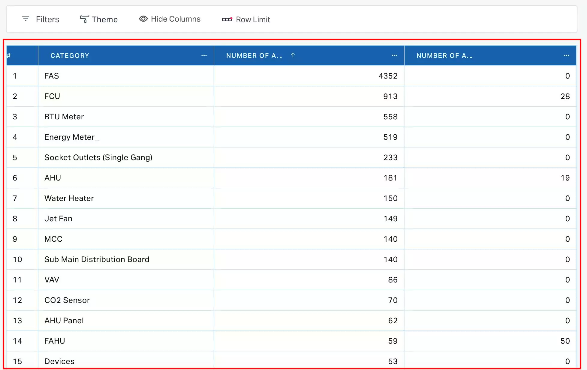
A sample illustration on creating a pivot table for the above scenario, is shown below.
This report shows the number of assets available for each asset category, giving a clear understanding to the user.
Customizing Pivot Table
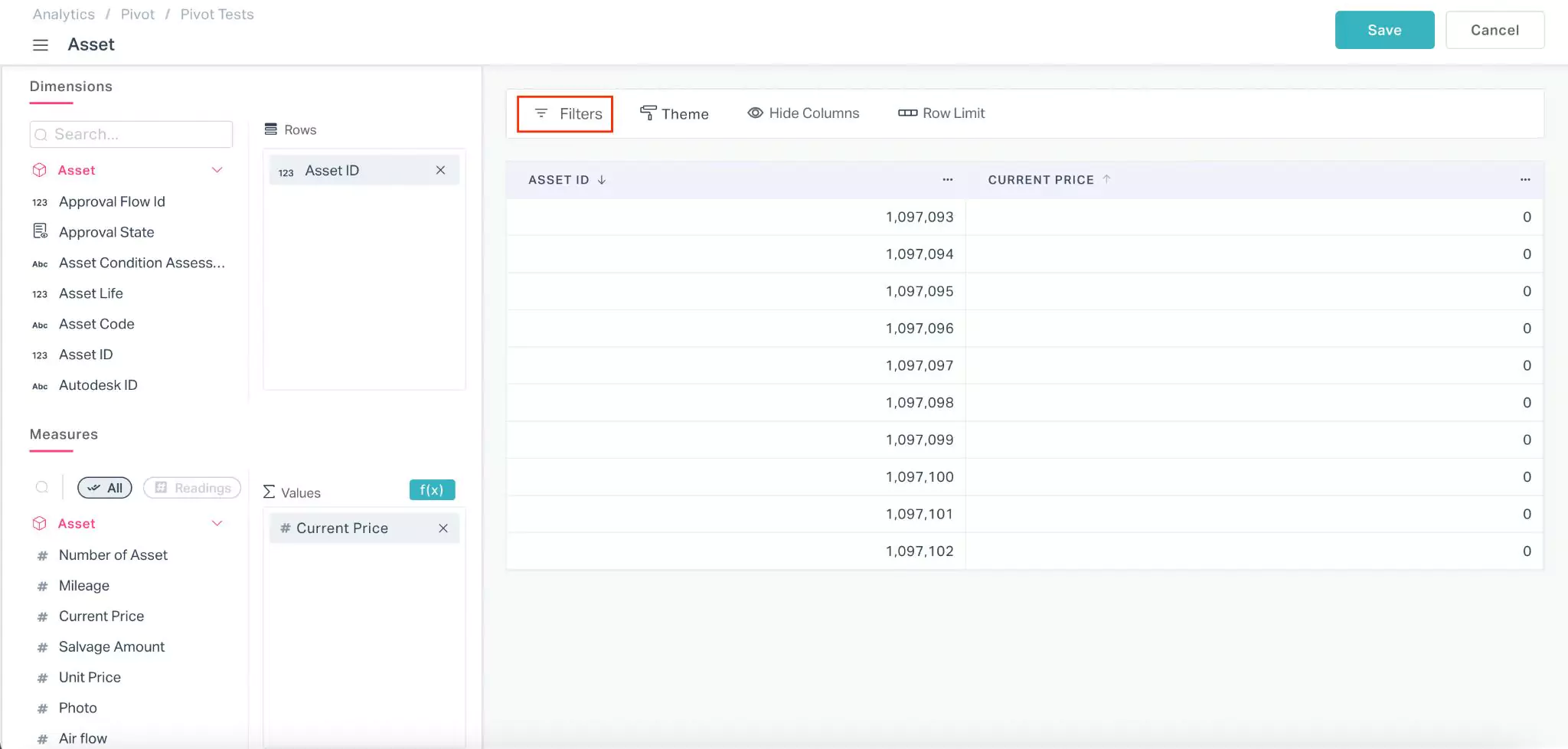
The application offers a wide range of options to design and improve the overall appearance of the pivot table. You can customize the table to make it more explicit and understandable. To customize the pivot table, navigate to the corresponding pivot table and click Edit. The screen to modify the pivot table settings appears, as shown below.
The customization settings are grouped under the following sections.
Filters
You can use filters to tailor the information presented in the pivot table to meet your specific needs. The utilization of filters enables you to swiftly investigate various scenarios and extract valuable insights from the data, all without the need for generating additional tables or engaging in intricate calculations. To apply filters, click Filters,
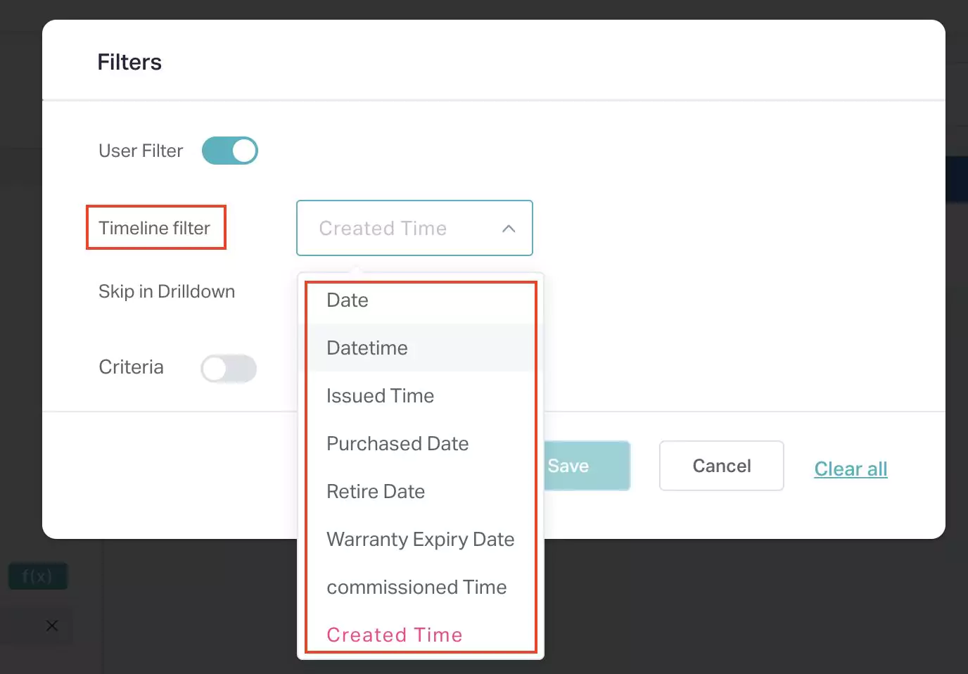
The Filters window appears with available options, as shown below.

You can apply User Filter or Criteria, or both options as per the need and specification.
User Filter
To apply this filter, enable the User Filter toggle. The Timeline Filter field appears with the list of date fields, as shown below.
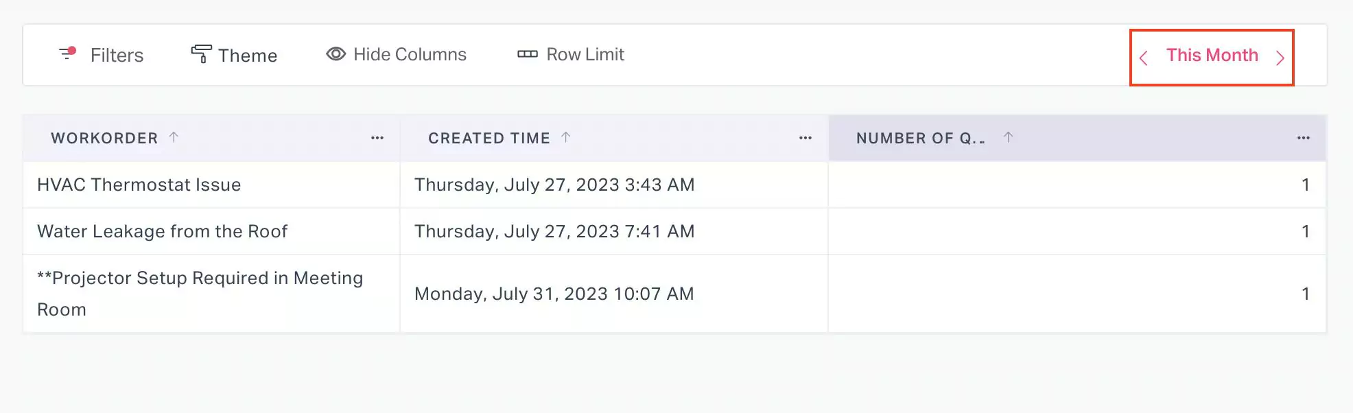
You can choose the preferred date field from the list based on which the timeline filter is applied over the displayed data. Also, a shortcut for timeline control appears at the top of the table, as shown below.
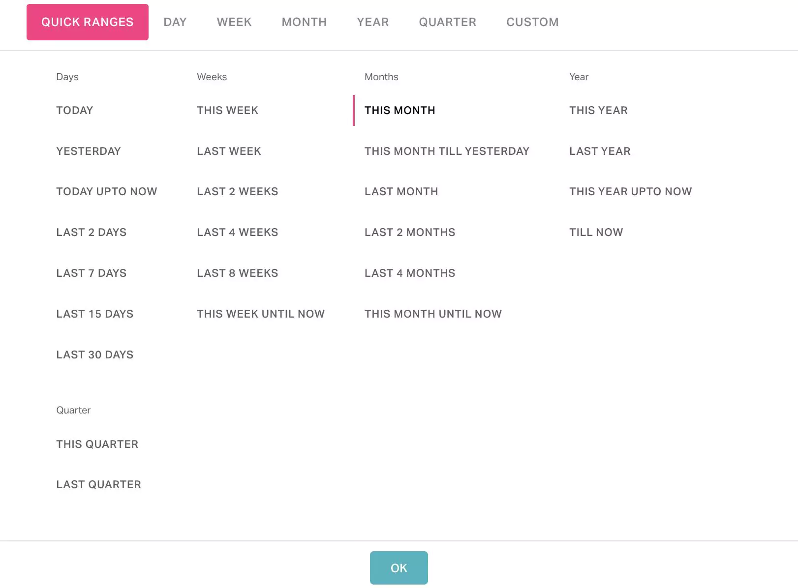
Upon clicking the timeline shortcut you can access the date and time range picker (shown below) and switch to another timeline view.
When you click on an entry in the pivot table you will be navigated to the list view of the corresponding module. Upon enabling or disabling the Skip in Drilldown option you can choose to display all the records or only the filtered records in the list view, respectively.
Criteria
Enable the Criteria toggle to set conditions for filtering the required data. The criteria configured can be a single condition or combination of multiple conditions. You can use the  and
and  icons to add or delete a record in this section.
Themes
The Themes option is applied to customize the look and feel of the table using attractive colors, improving the visualization of the presented data. As a part of customization, you can change the font size and table color, adjust row height, enable row numbers, apply zebra texture to the table, and more. To modify the pivot table look, click Themes at the top of the respective pivot table.

The customization window appears with themes settings as shown below.

You can modify the following aspects of the pivot table as required:
Font size - The text size of the displayed data
Table color - The background color of the header and the gridlines of the table. When the table color is set to blue, the pivot table appears as shown below.
Grid line - The lines separating the organized data visually. You can customize the appearance of the gridlines by choosing any of the following options:
- Both - The table displays both vertical and horizontal gridline
- Horizontal - The table displays only the horizontal grid line
- Vertical - The table displays only the vertical grid line
- None - The table does not display both the horizontal and vertical gridlines
Row height - The overall padding of each row
Show row numbers - The serial number for rows in the pivot table. Enabling this field displays the row numbers as shown below.
Show zebra rows - The color pattern of the rows in the pivot table. Enabling this field displays the alternate rows in different colors resembling the stripes of a zebra.
Applying themes in the pivot table enhances the overall look, interpreting the displayed data better.
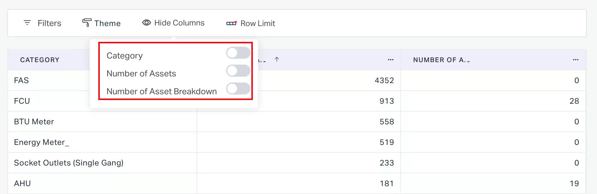
Hide Columns
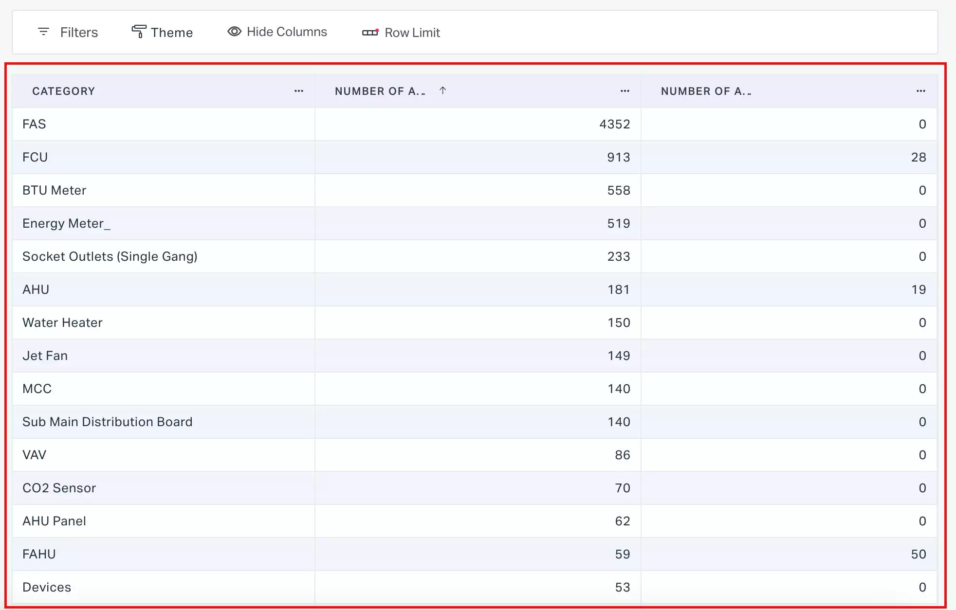
The Hide Columns option allows you to hide or unhide the required columns. Sometimes, a pivot table might have numerous columns that provide detailed information, but you might want to focus on a subset of those columns for a specific analysis. By hiding the least relevant columns, you can simplify the view and make it easier to focus on the key parameters. To hide columns, click Hide Columns corresponding to the pivot table.

The list of available columns are displayed, where you can enable or disable the respective toggle buttons to hide or unhide the columns, respectively.
Row Limit
The Row Limit option allows you to set a limit for the number of rows displayed in a table. Setting the row limit enhances the usability, improves responsiveness and reduces the risk of errors while performing analyses. To limit the displayed number of rows, click Row Limit corresponding to the pivot table.
The row limit window appears with the default row limit 50.

You can modify the row limit count as per your convenience. For instance, if this field is set to 10, irrespective of the available rows the application displays only the first 10 rows in the table. This option is useful when you are dealing with huge data or the requirement is to focus on the recent data.
Additional Functionalities
A pivot table allows you to visualize the row and column data using various personalization features, which is essential to view and analyze the data with clarity. You can click Edit against the pivot table and then click the  (horizontal ellipsis) icon in the required column header to view the available customization options.
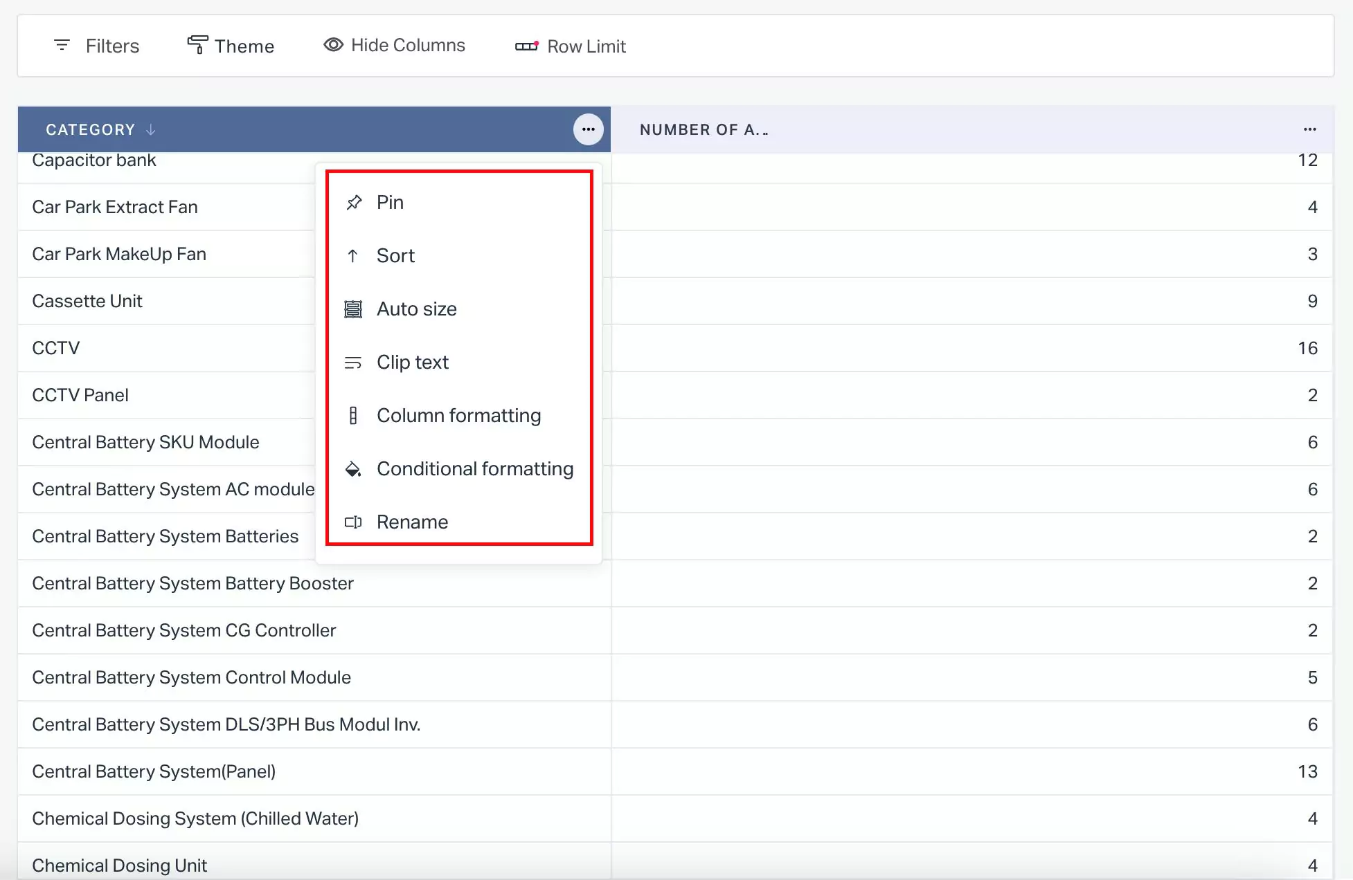
The upcoming sections explain how to pin, sort, autosize, clip text, visualize cells, format columns, make conditional formatting and rename the pivot table.
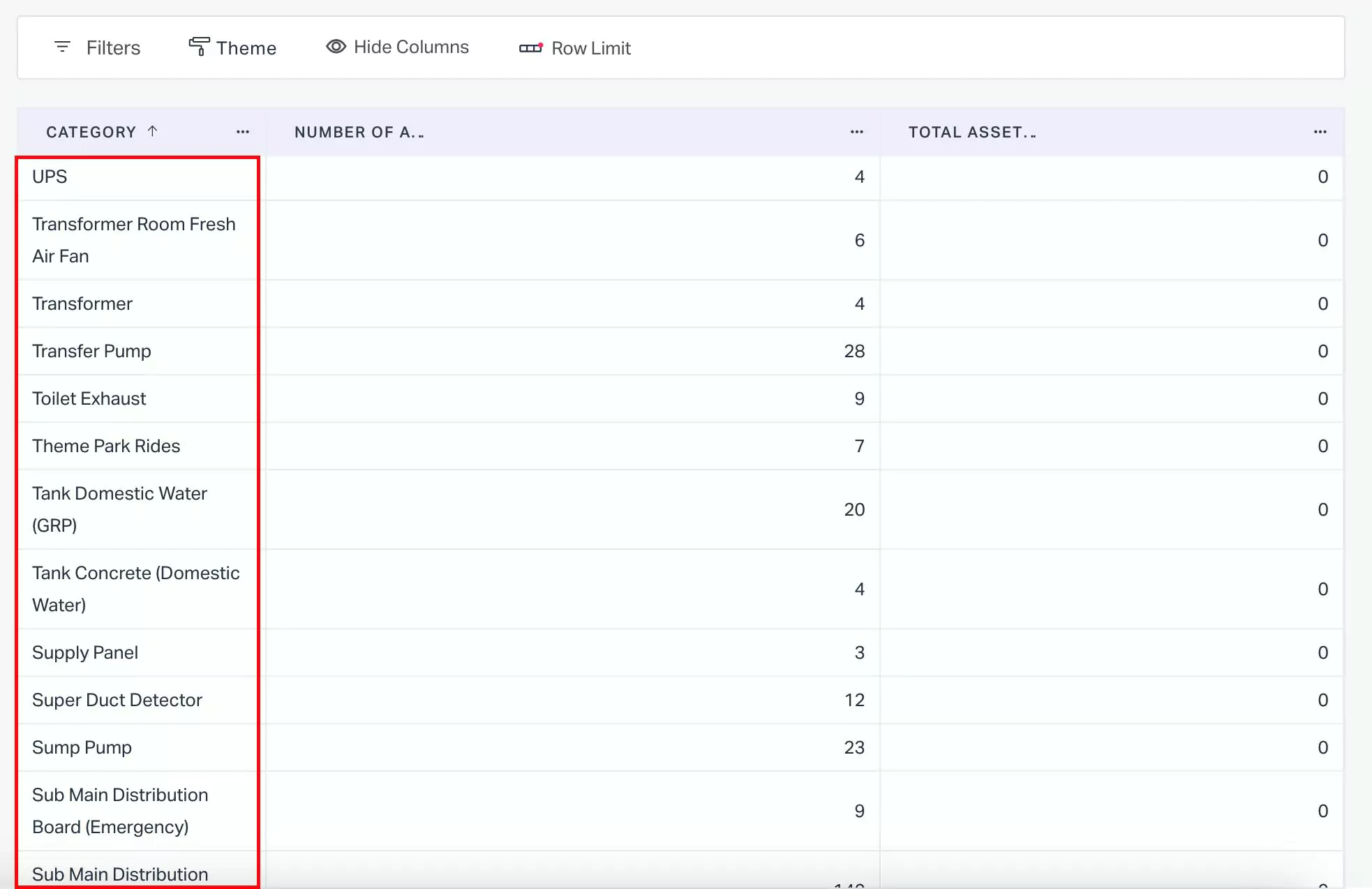
Pin
The pin option allows you to freeze columns in the pivot table. This is essential when working with large sets of data where you want particular information to remain visible at all times for reference, even as you navigate through different parts of the pivot table. To pin a column, select the preferred column and click the Pin option from the list. The column is pinned, and a pin icon appears on the left of the column header, as shown below.
If you want to unpin, click the (horizontal ellipsis) icon at the pinned column and select Unpin. The pinned column gets unpinned and the pin icon is removed from the column header.
Sort
This option allows you to arrange vast data in a preferred order to perform an analysis effectively. The application lets you view the data in ascending or descending order by sorting the required columns. Select the preferred column and click the Sort option from the list to sort the data. The application arranges the pivot table data in the selected order and displays a sort icon on the column header based on which the sorting happened, as shown below.
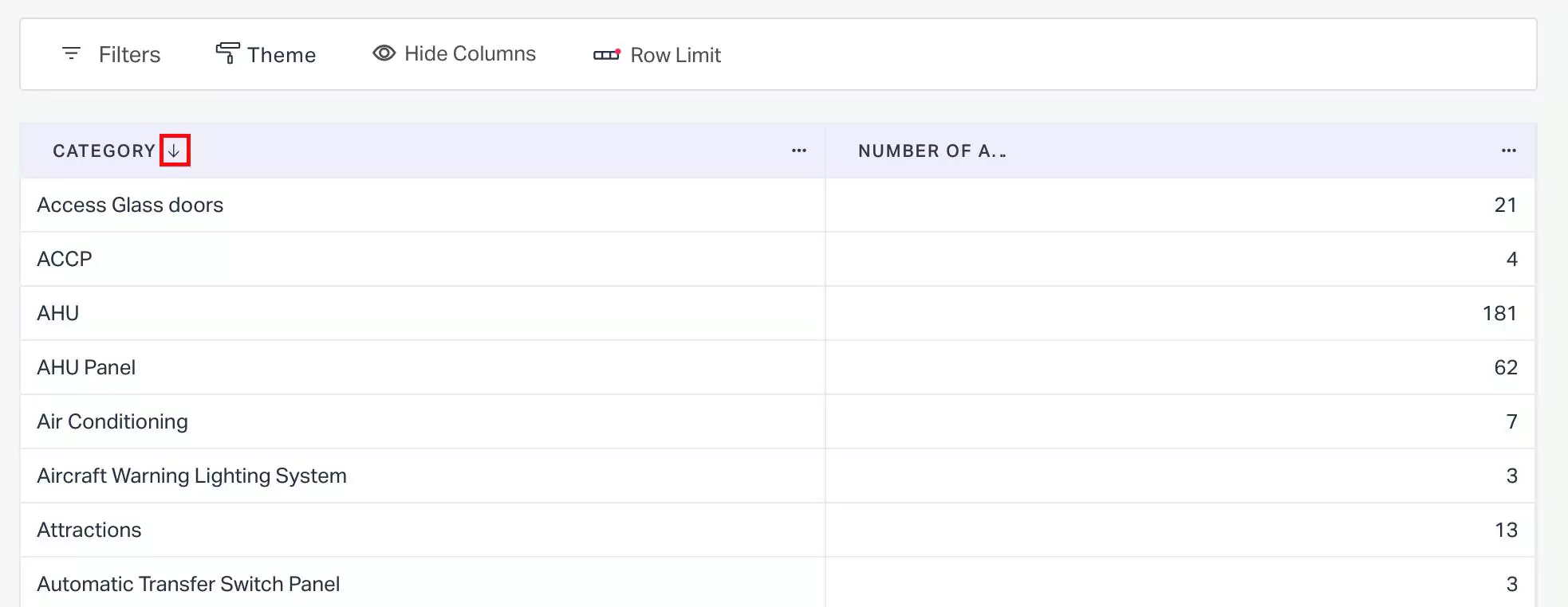
The icon displayed varies (  or
or  ) with respect to the sorting method (ascending or descending) selected.
Auto
The Autosize option automatically resizes the width of the column to fit the text in a cell without manual adjustments. This improves the readability and appearance of the pivot table by preventing issues, such as text overflow and oversized cells. To resize a column width, select the preferred column and click the Autosize option.
Clip/Wrap Text
The Clip text option truncates the content display and prevents it from spilling over into the next cell. This option should be selected when there is no need to view the full text of the column. To clip the text in a specific column, select the desired column and then click the Clip text option from the list. Once clicked, the table will refresh, and the text in the cells will appear truncated, as shown below.

Alternatively, you can choose to wrap the cell content within the defined column width at any time. The Text wrap option allows you to display text within a cell without truncating it. When you apply the Text wrap option, long lines of text are automatically wrapped to fit within the cell, instead of being cropped or extending beyond the visible area of the cell.
To wrap text, select the desired column and select the Text wrap option from the list. Once the changes are made, the table will refresh, and the text will appear wrapped within the cell as shown below.
Cell Visualization
The cell visualization option helps present data in different visual formats suiting your requirement. The data in each column can be displayed in numeric, bar format, pie format, and more, promoting data interpretation.
To configure visualization settings, select the preferred column and click the Cell visualization option from the list.

You can configure the following display settings to customize data visualization:
Visual type - The type of visual effects to represent data in each cell of the column. You can choose from the following options:
- Text - To view the data in text
- Data bar - To view the data in bars
- Compare with - To represent the data in comparison with the maximum value, a constant value or reference column. If you choose to compare the data with constant or reference value, you can set the constant value and reference column by clicking on the corresponding buttons.
- Circle - To view the data as a pie chart
Preview - To display the preview of the changes that would take place in the table after configuration
Fill color - To fill the cell background with the preferred color
Text color - To apply preferred color for texts
Show value - To display the value along with the selected visual type
Up arrow color and Down arrow color - To select the preferred color for up arrow and down arrow, respectively.
Note: This option is available only when the visual type is Compare.
Column Formatting
Column formatting refers to the process of adjusting the appearance of data within a column in a structured dataset, such as a spreadsheet or table. This formatting typically involves changing the way numbers or values are displayed to make them more readable or suitable for specific purposes. For instance, you can choose to display the number in a column as currency or percentages. To format a column, select the preferred column and click the Column formatting option from the list. The Format Column settings window appears as shown below.
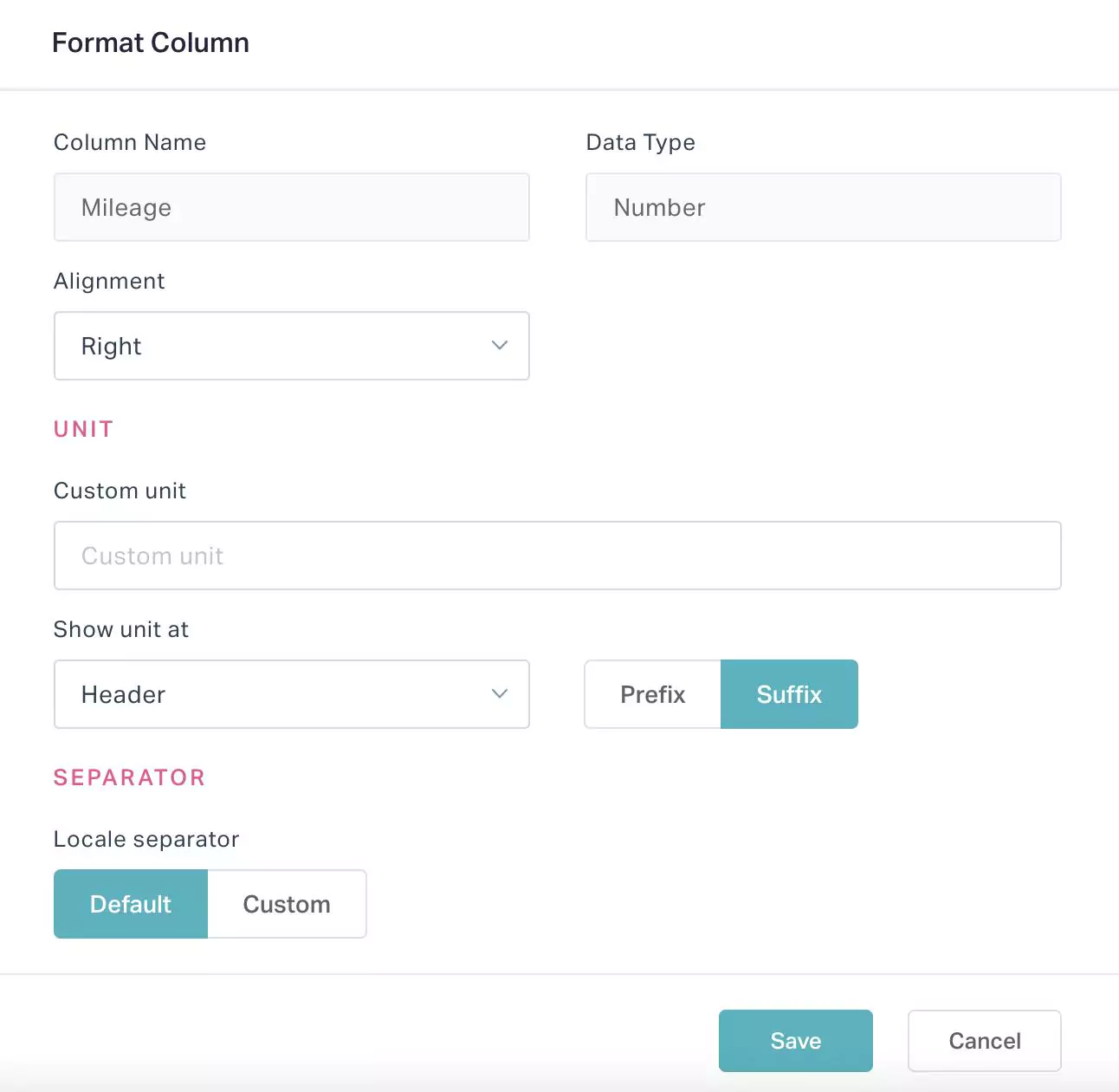
You can configure the following details to format the data display settings:
- Column name - The label to identify the column
- Data type - The type of value a variable or expression can hold
- Alignment - The arrangement of text within a cell. The available alignment options are left, right and center
- Custom unit - The standardized measure used to quantify or express a specific attribute or property. For example, km and pascal
- Show unit at - The location where the unit must be displayed. You can select either prefix or suffix of the column header or each row to display the units
- Locale separator - The symbols or characters used to separate parts of a number or date in a specific region
- Thousand separator - The character or symbol used to separate thousand, million, and billion digits in large numbers
Conditional Formatting
Conditional formatting favors automatic formatting of cells or ranges of cells based on specific conditions or criteria. The primary purpose of conditional formatting is to visually highlight or emphasize data that meets the predefined rules, making it easier to identify patterns, trends, or outliers within a dataset. It enables you to apply formatting styles, such as changing text color, background color, font styles, and more on cells or values in the table based on user-defined conditions. These conditions can be related to the cell value, another cell value, or any logical expression. To apply formatting, select the preferred column and click the Conditional formatting option from the list. The Conditional formatting window appears as shown below.

You can configure the condition and respective formatting aspects through the following fields:
Criteria - The condition(s) based on which the formatting applies to the selected column
Note: You can use the icons to add or delete condition(s). In case of multiple criteria, you can choose to match all or selected criteria using the Match All and Match Any options, respectively. You can remove all existing conditions at once using the Clear all option.Cell background - The color that fills the area within a cell
Text background - The color that fills the background area of the text in a cell
Text color - The color to be applied for the characters in the cell
Display value - The value to override the text or data upon the condition being satisfied
Text style - The font style including options like bold and italic
Blink - Check box that enables the text to blink upon the condition being satisfied
Rename
You can manually rename columns and enter an appropriate name as preferred. To modify the column header, select the column and click the Rename option from the list. After you have entered the new label for the column, you can save the changes by hitting Enter.